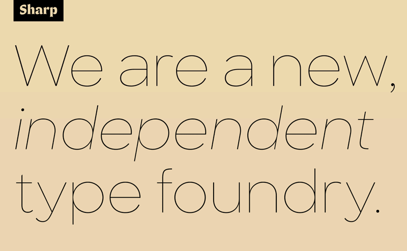
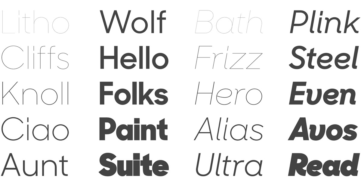
Sharp Sans
I’m adding Sharp Sans to my list of fonts I hope to find an opportunity to work with soon.
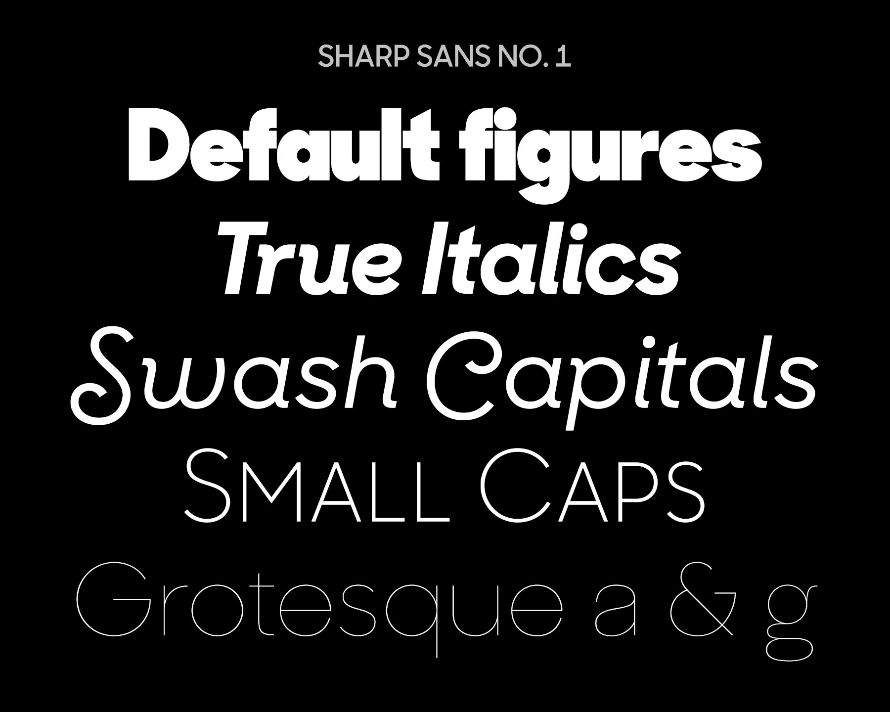
A description from Village Type & Design:
Sharp Sans injects some much needed humanism into the Futura model. With its sheered terminals and true italics, Sharp Sans combines the appealing typographic compensation of the grotesque, with the plump circular bowls of the geometric. The result is a typeface suited for both text and display use that breaths life into the genre of the geometric sans.