CSS Box-Shadow:Inset
You’ve gotta appreciate the imageless design elements the CSS box-shadow property makes possible. No more slicing up 3 jpgs to recreate the depth so easily gained in Photoshop. Lately, we’ve been using box-shadow:inset on some Paravel jobs, and I’ve seem some clever uses out there on the intertubes. This property is compatible with Webkit (Safari & Chrome), Firefox, Opera, and IE9, so there’s no reason to hold off using it as an enhancement on the page you’re working on right now.
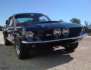
Now, what about images? It’d be nice to be able to add a vignetting effect to photos sans-Photoshop, but the way browsers interpret box-shadow:inset is to throw the shadow behind the image, rendering it invisible. While this seems pretty useless, it does make sense when you consider other kinds of content. For example, if you inset a shadow you probably wouldn’t want it overshadowing the text within.

A reasonable way to circumvent this issue would be to wrap the image in a div or a span element and employ some basic z-indexing. See the example code provided below. While this method gets the job done, I wonder if it’d be sensible to update the CSS Working Draft to allow for inset shadows to be displayed on top when applied directly to an image. Despite the inconsistency, it seems intuitive to me and would ultimately lead to cleaner, simpler markup.
<div class="vignette"><br />
<img src="mustang.png" alt="mustang" class="car_photo"/><br />
</div>
.vignette{<br />
box-shadow:inset 0px 0px 85px rgba(0,0,0,.5);<br />
-webkit-box-shadow:inset 0px 0px 85px rgba(0,0,0,.5);<br />
-moz-box-shadow:inset 0px 0px 85px rgba(0,0,0,.5);<br />
}img.car_photo{<br />
z-index: -1;<br />
position: relative;<br />
}


