The New Adventures Paper

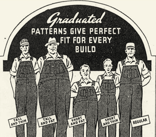
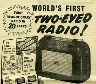
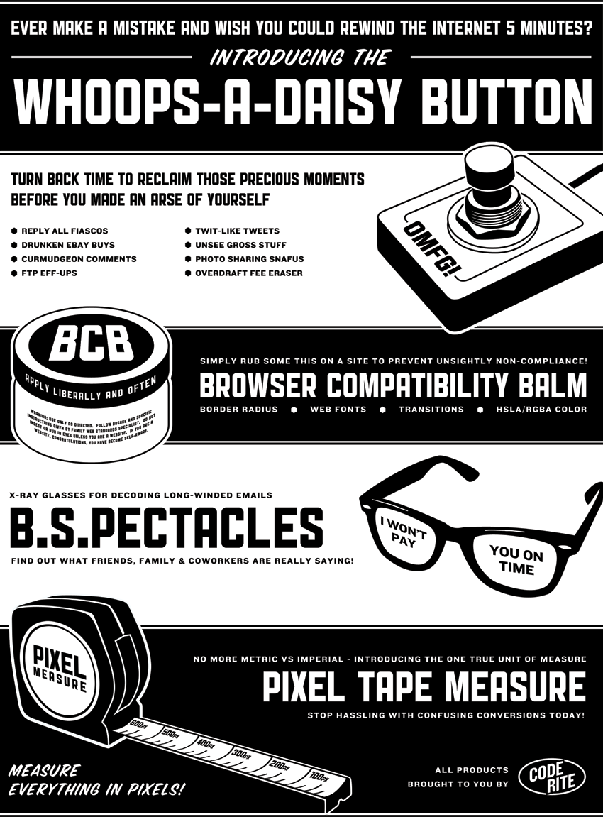
I met Simon Collison back in October at Brooklyn Beta. Shortly after, I got an email from him asking if I’d be interested in contributing to the newspaper he was having printed for attendees of the New Adventures In Web Design conference. Needless to say, I was thrilled & honored to get a full page to do whatever I wanted. After listing a few article topics out I started to think about the newspaper medium itself and how amusing I find those infomercial-like miracle mail order product adverts.
overalls
radio

I found some great examples and decided I’d invent a few products of my own, mimicking that bold, superlative-laden style. For my advert I decided to dream up a handful of things that, at one time or another, we all wish existed. The laws of physics and nature aside, I think I did fairly well.
code rite

It was a privilege to be able to contribute alongside my industry cohorts, and I’m thankful that Simon decided to get behind my silly idea. Oliver Wood did an excellent job designing the paper (I love that FF Meta Serif). The newspaper is now available for purchase in either PDF or PDF & paper copy format. Get your own copy of the New Adventures In Web Design Newspaper

Lettering.js & Twitter’s Year in Review

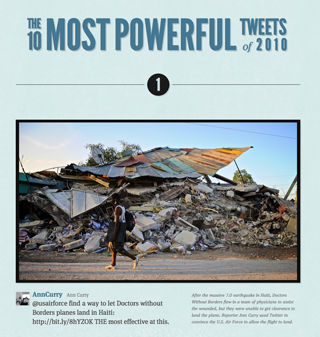
We were thrilled at the Paravel office to see such a great use of Lettering.js on Twitter’s 2010: Year In Review site- specifically on the headline for The 10 Most Powerful Tweets of 2010Josh Brewer, and the rest of the Twitter design team used it to split up the words within the title h1 to resize, position and change fonts; achieving a none-too-shabby intro to the page.

Twitter’s 2010: Year In Review

If you have built or seen anything built with Lettering.js, please do let us know.  We’d love to feature it on the site.

RGBa & HSLa CSS Color

In certain situations, RGBa (red, green, blue, alpha) and HSLa (hue, saturation, lightness, alpha) color values can save the day.  It’s widely supported in Chrome, Safari, Firefox, Opera, and IE 9, and when working with box-shadow, text-shadow, or when needing to apply a reduced opacity to a color without affecting the rest of an element, RGBa and HSLa can’t be beat.  Dave Rupert and I recently put each type of value to work while building the Lost World’s Fairs project.

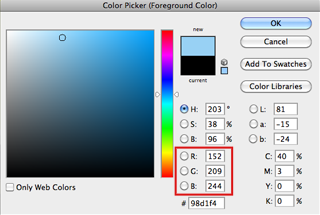
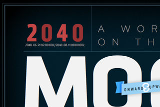
When coding The Moon, by Jason Santa Maria, we used RGBa to blend all of the light blue border brackets into the gradient background.  We wanted to be precise, so we pulled the exact R, G, and B values from Photoshop and set the alpha to .3 to match the opacity.  Here’s an example line of code for one of our multiple CSS border properties:

#main{border-left:1px solid rgba(152,209,244, .3);}

Photoshop color picker
Lost World's Fairs Moon

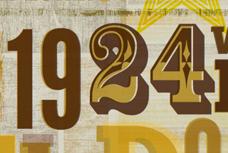
In this case, RGBa was the most accurate option.  If you tried to pull the HSL values from Photoshop in the same manner, it simply wouldn’t match up. Now, when it comes to making on-the-fly adjustments, I prefer HSLa.  Hue is fairly easy to chart out once you find your way around the color wheel, and from there, fidgeting with saturation and lightness percentages is a breeze.  Naz Hamid’s El Dorado poster had some Photoshop color-burn blending effects on the type which made HSLa perfect for tweaking each of the color values to perfection.  Here’s an example of one of our CSS implementations for HSLa:

#eldorado{color:hsla(44, 100%, 33%, .70);}

El Dorado
El Dorado

Chris Coyier has a nice write-up on HSLa color over at CSS Tricks, which includes a handy resource for a Mac app called Colors that lets you select a color on your screen and converts it to the color value format of your choice.  I’d love to see something similar to that integrated into MacRabbit’s CSSEdit.

Update: Paul Irish just released a lovely HSL selection tool called MothereffingHSL.com

Also check out workwithcolor.com‘s HSL color picker

The Old Car Manual Project

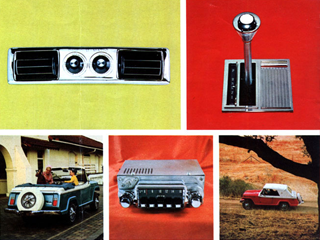
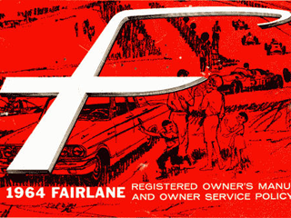
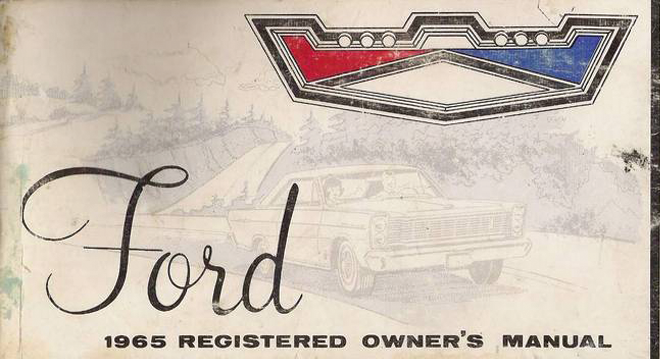
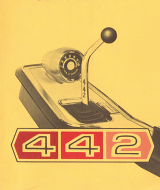
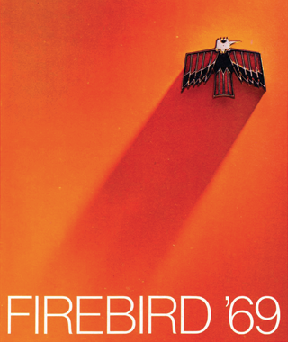
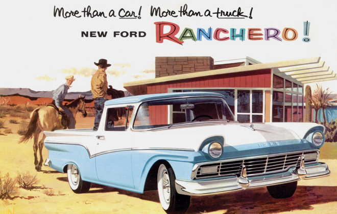
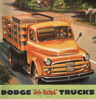
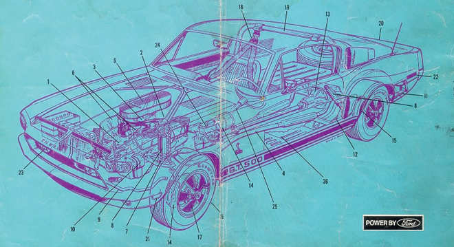
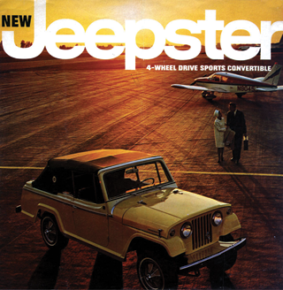
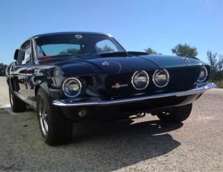
I love old cars- especially all the badges, manuals, and logos that came along with them. I’ve even taken to recreating an old Ford logo & Shelby Mustang badge a few weeks back. Recently, while clicking around I hit the automotive design jackpot. The Old Car Manual Project is a regularly updated archive of scanned manuals. There are currently over 42,000 pages there now, so pace yourself! As a teaser, here are a few of my favorites:

Jeepster
Ford Fairlane
Ford
Olds
Firebird
Ranchero
Olds
Firebird
Ford
Jeepster
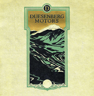
Duesenberg

If you spot any gems over there please do comment & link them up. You can also contribute by pitching in with a monetary donation, or some scans of your own.

CSS Box-Shadow:Inset

You’ve gotta appreciate the imageless design elements the CSS box-shadow property makes possible. No more slicing up 3 jpgs to recreate the depth so easily gained in Photoshop. Lately, we’ve been using box-shadow:inset on some Paravel jobs, and I’ve seem some clever uses out there on the intertubes. This property is compatible with Webkit (Safari & Chrome), Firefox, Opera, and IE9, so there’s no reason to hold off using it as an enhancement on the page you’re working on right now.

box-shadow: inset
When building Camp Wapo, we used inset on the action item buttons.
box-shadow: inset
Lettering.js has an inset hover state on each of the linked images.
box-shadow: inset
The feature box on A Book Apart has a nice vignette shadow framing the div.
box-shadow: inset
When logged out, the Rdio homepage employs inset shadows on their features list.

Now, what about images? It’d be nice to be able to add a vignetting effect to photos sans-Photoshop, but the way browsers interpret box-shadow:inset is to throw the shadow behind the image, rendering it invisible. While this seems pretty useless, it does make sense when you consider other kinds of content. For example, if you inset a shadow you probably wouldn’t want it overshadowing the text within.

box-shadow: inset

A reasonable way to circumvent this issue would be to wrap the image in a div or a span element and employ some basic z-indexing. See the example code provided below. While this method gets the job done, I wonder if it’d be sensible to update the CSS Working Draft to allow for inset shadows to be displayed on top when applied directly to an image. Despite the inconsistency, it seems intuitive to me and would ultimately lead to cleaner, simpler markup.

<div class="vignette"><br /> <img src="mustang.png" alt="mustang" class="car_photo"/><br /> </div>
.vignette{<br /> box-shadow:inset 0px 0px 85px rgba(0,0,0,.5);<br /> -webkit-box-shadow:inset 0px 0px 85px rgba(0,0,0,.5);<br /> -moz-box-shadow:inset 0px 0px 85px rgba(0,0,0,.5);<br /> }
img.car_photo{<br /> z-index: -1;<br /> position: relative;<br /> }

Keep On Learning

Josh Brewer’s latest 52 Weeks of UX article, Keep On Learning, about continued web education and remaining relevant is spot on.

I implore you: never stop learning because the moment you stop learning is the moment you become obsolete.

The web is unique in that none of us can predict exactly what we’ll be doing in 5 years time.  What will web pages look like?  What language will we be coding in and for which devices?  To say you are a web professional isn’t to say that you’re a CSS or Ruby specialist- it’s to say you’re constantly committed to discovering and learning about what’s next.

There are days where each hour is blocked out as billable time for client work, but every day can’t be like that- especially for web professionals.  As a boss, I know that learning through experimentation and exploration makes my employees more valuable.  As a worker, I know that if I’m going to have a job in this industry next year I’d better learn something new.

Brooklyn Beta

Brooklyn BetaCameron Koczon, Chris Shiflett and the rest of the gang knocked it out of the park this year with their first Brooklyn Beta conference.  It was a privilege to be there with such a great group of attendees and speakers.  Rather than providing step by step “how-to” instruction, talks seemed to focus more on personal experience, candid advice and doing things with love, which I always appreciate.  The Invisible Dog has to be the coolest space you could host a conference and Brooklyn is such an exciting place to be.

Above all, it was a thrill to meet so many people I’d been trading tweets and blog comments with over the years.  It’s sort of like meeting your home room back in elementary school for the first time, trying to balance your goofy enthusiasm with your desire to make a good impression.  Thanks again to Cameron, Chris and the gang, our excellent hosts.  You did a wonderful job & I can’t wait for the next one.

Check out Chris Casciano’s Brooklyn Beta Flickr photo set

Instagram

InstagramFor the past week or so, I’ve been sharing photos and tapping my way around this new iPhone app called Instagram. It lets you take photos in a square Polaroid format and pass them through a series of throwback filters before sharing. To me, where it stands apart is on the social side of things. Being able to comment, like and even just see the photos your friends take makes it unique, and when paired with seamless integration for flickr, twitter, facebook, tumblr and foursquare, I think this app will be well-loved.

In the future I’d love to be able to comment & like photos from outside my iPhone. I’ve also noticed that the pull to refresh iphone gesture has now been ingrained in my multi-touch skill-set, so that would be nice as well. You can download Instagram for free at the App Store.

Fun With CSS Text-Shadow

I used 100 text-shadows to make the graphic below happen. Sure, it’s excessive, ridiculous and just plain silly. But why, at times, can’t the web be all of those things? I’m all for sensible, well-reasoned CSS, but let’s keep things in perspective. We’re not surgeons. We can experiment without causing anyone bodily injury. So go! Have a blast! Pull up your localhost and build something wonderfully useless! Click Here if you’d like to see the CSS.

BAD!