Web Fonts I Look Forward To Using
The present & future of web fonts is looking awfully bright. Quality and Quantity are increasing, though there are still a few fonts I have to pass over when designing for the web. While I don’t know if all of these are in the pipeline to become web fonts, I have to believe that all type foundries are moving in that direction so that their fonts remain useful. It’s important to note that this shouldn’t be read as a “what’s the holdup” post. Creating high quality web fonts is no simple task. The only thing worse than a font you can’t use on the web is one that can be used but renders poorly.
Case in point: I recently replaced Futura served by an unnamed service with the relatively new Futura PT from ParaType served via Typekit. There was a significant improvement in tracking as well as rendering. Here’s a short, non-comprehensive list of fonts I’d love to put on a webpage.
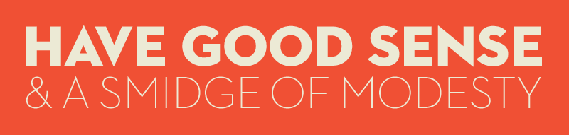
I love House Industries. Neutraface & United have both been long time favorites of mine, recently used here, here and here. Happily, the FAQ on their site mentions that a subset of the collection will be available in October of 2011.
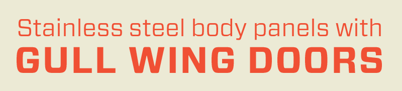
Another foundry that is working to make their fonts available is Hoefler & Frere-Jones. I love Tungsten but am particularly interested in using Vitesse & Forza for both headline and paragraph text.
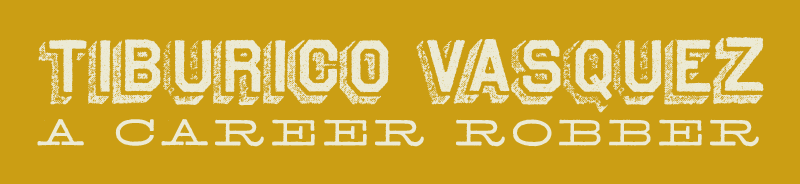
Archive type makes me giddy, and their Archive Steeler looks fantastic on Andy McMillan, Jez Burrows, and Carolyn Wood’s latest project, The Manual. I also like Archive Antique Extended.
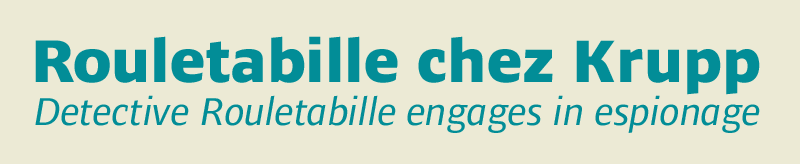
Ardoise from Typofonderie is a workhorse. Taking all the styles, widths and weights into account, you’ve got 45 options in the family. I also quite like Le Monde Courrier, which is already a web font.
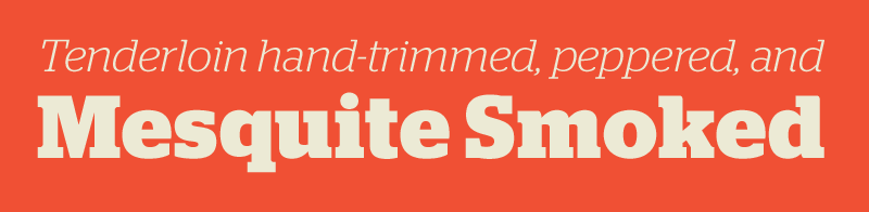
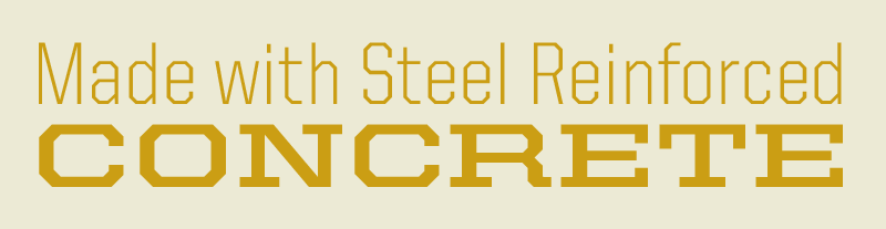
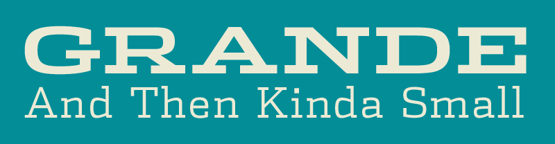
Stag, another workhorse, is a unique slab serif with lots of companion families: sans, dot stencil, and sans-rounded. I dig them all.
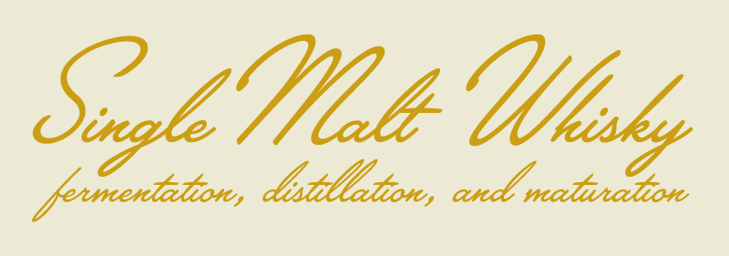
Mark Simonson created Proxima Nova, a web font we use on the Paravel website. He also created a really nice script font called Lakeside. There’s something about it that just really jives with me, especially the alternate, extra-large titling caps.
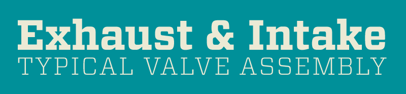
Dispatch from Font Bureau comes in 16 styles, and I bet I could find a use for all of them starting with Extended Bold.