The last version of this site lasted just under a year. That may seem like a short amount of time until you consider how quickly things change on the web.
@font-face usage has been fortified by services like Typekit & Fontdeck, CSS3 & HTML5 are popping up everywhere, and with the release of the iPad, multi-touch technology is drastically changing web design. My goal has been to cut out the extra divs, widgets and doodads so browsing is more fun for you and posting is less work for me.
There’s nothing on that plate but gristle & fat!
I wanted to start by clearing out all the non-essentials. Any elements that weighed down the markup, design or user experience from the previous version had to go. I scaled back the footer by removing the black content box, list of posts and tweets. The Comments section was updated by trading the author comments in the margin and indented threads for a good ol’ fashioned list with @replies. I 86-ed the 1px horizontal lines filling the page margins. Though they did frame the page nicely, they cramped art-directed posts’ style, and the same effect can be achieved with well-placed text and line-height.
Inspired by Multi-Touch
This site wasn’t intended solely for the iPad, though it is inspired by my experience browsing the web sans mouse. Many of the assertions I made before getting an iPad have been strengthened each time I slide, swipe and tap my way across the inter-web. Each change I’ve made (larger font size, less content/page, fewer columns) has been shaped by my belief that the future of web design lies in making browsing all play and no work. Hunching over a keyboard at a desk and squinting at an overstuffed page with 12px font is work you don’t get paid to do, so why do it?
A New Mark
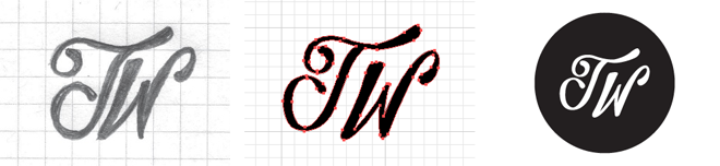
I knew I wanted to move away from Helvetica as the typeface for the body copy as well as for my logo. I thought the mark needed a hand-drawn look to offset all the obsessive pixel pushing I was bound to do while designing. Fortunately, Reagan Ray was willing to bring custom lettering talent to the process. After trading a few ideas, Reagan took to sketching and then ran a few lettering options through Illustrator. I immediately gravitated towards this script version, dropped it in a black circle and let it set the tone for the rest of the site design. More than anything, my favorite thing about the new mark is that Reagan did it. I dig his style… always have and always will.
The Design Process
Once I had the new mark & simplified content list I set out to experiment with design, mainly consisting of 30 minute design sessions where I’d try different combinations of fonts, font sizes, page widths and line heights which were checked with fresh eyes at regular intervals during the day, using both a point-and-click interface and the iPad. After a couple of weeks, I settled on a 1000px wide site with a 23px baseline grid for the text.
Updated Typography Served Up Via Typekit
For the body copy, I went back and forth between a 14, 16 and 18px font size. 14 seemed small when zoomed out on a touch device, but 18 seemed excessive on my laptop, especially when you consider how large heading fonts would need to be to maintain visual hierarchy. So, 16px Georgia it was until I found FF Meta Serif via Typekit. I love this typeface and think it interacts well with the new mark. I also enjoy using Typekit & believe that they’re doing important work for both the web and type communities.
The Code-out
The markup & WordPressing process was aided by Nathan Staines’ HTML5 adaptation of Elliot Jay Stocks’ Starkers theme. In addition, CSS3 came in handy in quite a few cases. Whenever possible, I gladly trade larger javascript files or semi-transparent pngs for a single line of progressively enriched CSS code. The search page uses -column-count and column-gap to set the tags into columns, and I use rgba color to set the 1px lines on the header and footer. I also threw in 0.2 second ease-out transitions for the link hovers. With the help and council of Paravel’s Development Sensei, Dave Rupert, I was able to minimize file size and load times by running images through ImageOptim, making icon sprites and installing WP Super Cache.
Content Navigation
I had 3 times the content to work with this round and saw a real need for a good search page and tags system, which were added to the main navigation. While I enjoyed displaying those billboard style banners on the Articles page, it became progressively harder to find older posts. Now the layout mimics the notes page, but with post-style referencing thumbnails. I also added a more prominent Previous & Next navigation for easy browsing. I sure hope you enjoy the updated site. Let me know what you think.