I had my brand new retina display iPad (all 3.1 million pixels) in one hand and the panic button in the other.
I was sure the pixel-dense screen would take the websites we’ve built and peel back their layer of pretty, revealing something less than perfect (like HD cameras did to sitcom actors). Was this layer we’ve so painstakingly designed, sliced, exported, and built stylesheets around really so thin? Just before the screen lit up, I realized this was nothing new. For the first time, I saw the Internet for what it really is—a tall, lanky junior high kid who is pissed at the world because he just got done being a short, fat grade schooler. It’s never just right. Rather than grow proportionally and gradually, it hits terribly awkward spurts that throw everything off balance.
So, how will the retina change the shape of the web, and do we need to rush to update everything we’ve ever built? Of course not, part of building for the web is accepting that everything is in a constant state of flux—there isn’t enough time and money in the world to “fix” the internet every time a company releases a new technology. Instead, we cling to sensibility by seeking a middle ground and building things with the future in mind. Here are a few specific things I’ll do (or continue to do) as screen resolutions evolve:
Rely on web type & CSS.
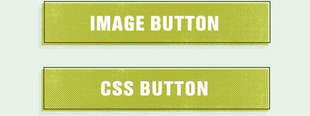
We’ve always wanted better rendering for web fonts, and seeing type on a pixel-dense screen for the first time is mind-blowing. It’s also a validation that our commitment to making great type happen on the web without image replacement has paid off. Retina exposes those places where images are used rather than HTML text or CSS. Next to the ultra-crisp text that CSS + HTML render on retina, those fuzzy spots around image buttons and letters tend to stand out. For comparison, here’s a retina iPad screenshot of a button exported as an image, then rendered with web type and CSS (minus the dot texture):
I recently wrote that seeing how blurry the sprite icons on this site looked next to retina text pushed me to get to know font icons better. The advantages are numerous, namely how easily scalable they are and how quickly we can re-color or transition them with CSS. Using font icons whenever possible seems like a low-risk investment. Especially when implemented with care.
Images shouldn’t all be doubled in size…
unless, perhaps, you’re serving images as amazing as NASA. It might make sense to use media queries to target pixel density for handling things like background images in CSS, or even look to Retina.js to serve larger images to high-resolution displays, but should we always do it? As designers who’ve learned that every millisecond counts for load times, we can’t assume that just because someone is browsing from a retina device, they want to download 2x the image assets. Alongside that, there are a lot of smart people working on responsive images, and perhaps the picture element will prove to be the most sensible method, at least for inline images.
Of course this is subjective, but I’d say that for the most part, even 72dpi images (photographs, textures, and illustrations) look better on a retina display. Now that we’ve been using fluid-images and CSS background-size for responsive sites, when those images display even a little smaller than actual size, those smushed together pixels actually continue to shine through on retina. So, perhaps it doesn’t always have to be about serving uniquely-sized images to each device. In many cases, I think loading images that are just a bit better will go a long way. Make images a few percentage points (not 2x) larger, then optimize the hell out of them.
A pixel is still a pixel.
At least it is as far as I can tell. I’m sure I’m not alone in saying I’m scared when I think about how pixel densities across multiple devices will impact web design, but I have to say that everything I’ve seen thus far puts me at ease. Right now I am staring at a 1 pixel line drawn with CSS on a retina iPad and an iPad with an older display. They look the same. I’m not saying there’s not a lot of work to be done, just that I’m relieved to see that device makers seem to be doing quite a lot of it. Likewise, if we rely more on CSS than image exports, I’d say we’re doing our part.
So, that panic button? It gets to go back into the drawer for another occasion. Sure, the internet’s clothes are going to fit funny for a while as it figures out how & where to put all those extra image KBs, but we’re going to be okay. These are awkward times, but rejoice. We all get to play the role of the guidance counselor: having discussions, writing specs, and building tools that continually reshape the web into its full potential.