Uncharted Territory
With the addition of the CSS3 transition property comes a lot of uncharted territory. Never before has it been so easy to bring animation into a usable, standards-based browsing environment. Determining how often and to what degree one should use animation on a web build can be tricky. As we evaluate how to implement animations from project to project, we’ll need to carefully consider how it might affect user experience. Here are a few observations I’ve made from the field.
Consider the Psychology of Motion
Motion demands attention. When someone is trying to find you in a crowded room, what do you do? Wave. When check engine lights go from illuminated to flashing you know it’s time to take the car in for service. Websites are no different. When you’re deciding whether or not to continuously animate an element by spinning or panning, consider the content.

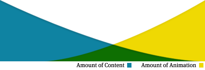
I’d say it’s a general rule that the more content you have on a page, the less motion you can get away with using. I think the FWOD 404 page is a great example. It’s got a gigantic planet spinning, but there is only a phrase from which it pulls one’s attention. Now, I’m talking about animations that happen regardless of where the user clicks or hovers. Links & navigation items are a completely different ball game.
Linking & Navigation
I really enjoy adding the transition property to make links & menu bars fade in and out, but I have to be careful. If the transition is too slow, users may fail to pick up on the visual cue that says, “This is clickable.” Slide your mouse pointer horizontally across each navigation bar of the examples below.
Notice how with the first row, you can make it all the way across the bar with no hover state clearly appearing. Sure, users can probably figure out that these are links, but why progressively enrich if it degrades user experience? The second option brings in a more immediate hover with a nice, slow fade.
It’s all been done before…
…with Flash. Most people don’t know or care about the difference between animations done with Flash, Javascript or CSS3. Seeing things moving online is nothing new for users, and while the design & development community may be thrilled to have a simple and software-independent solution for transitions, we’re still going to have to learn to use them wisely.