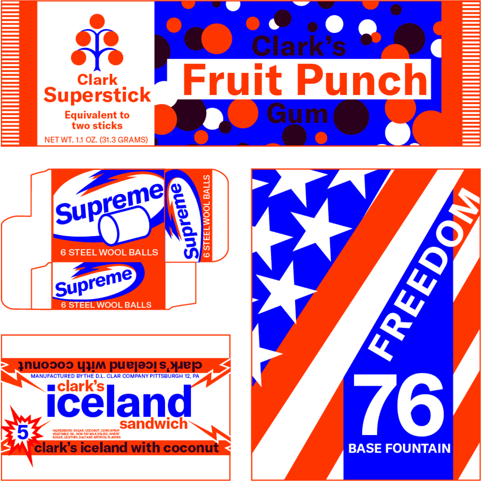
Metroid Type Explorations
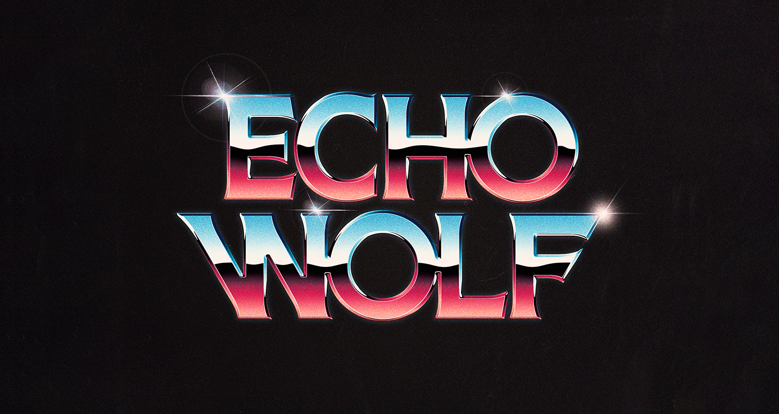
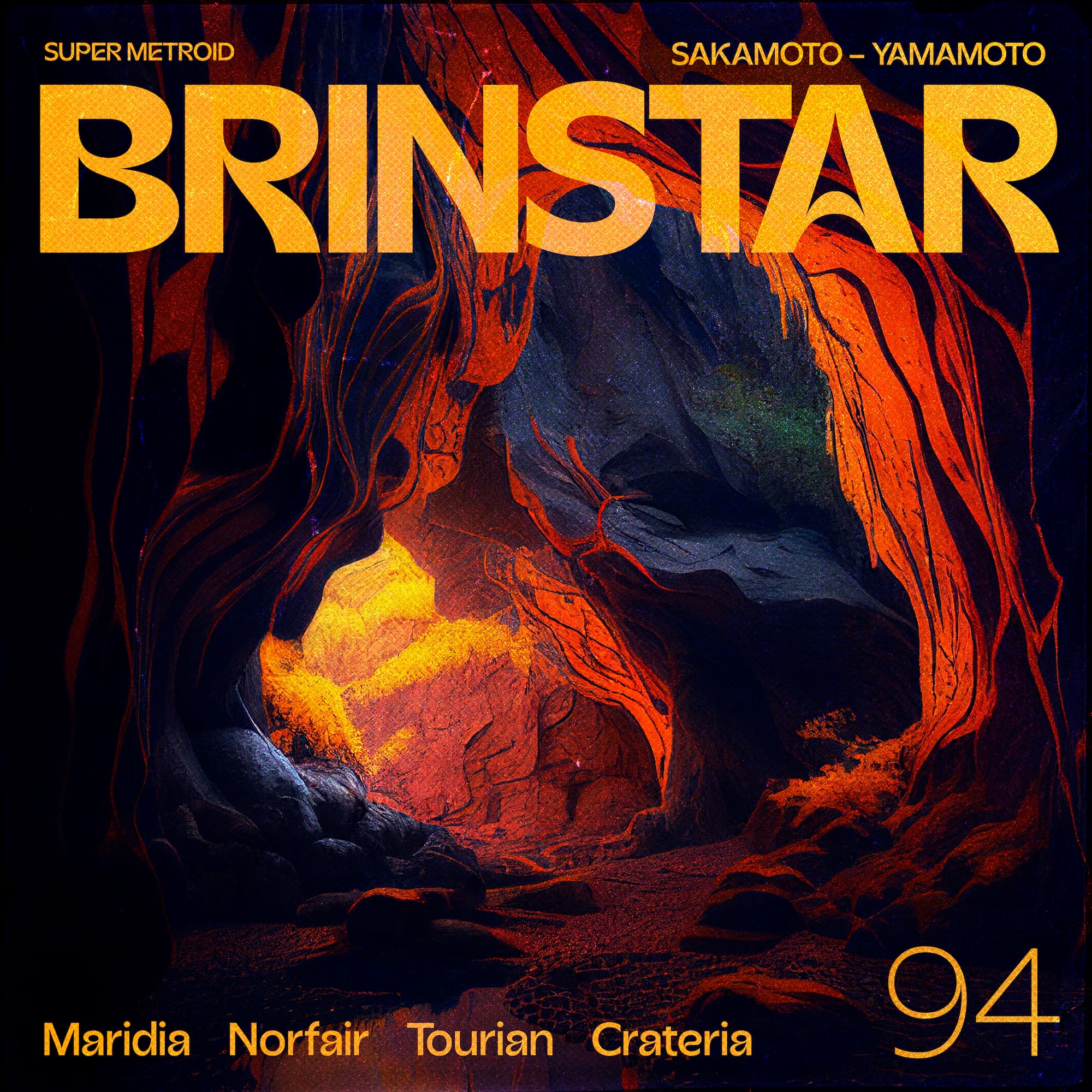
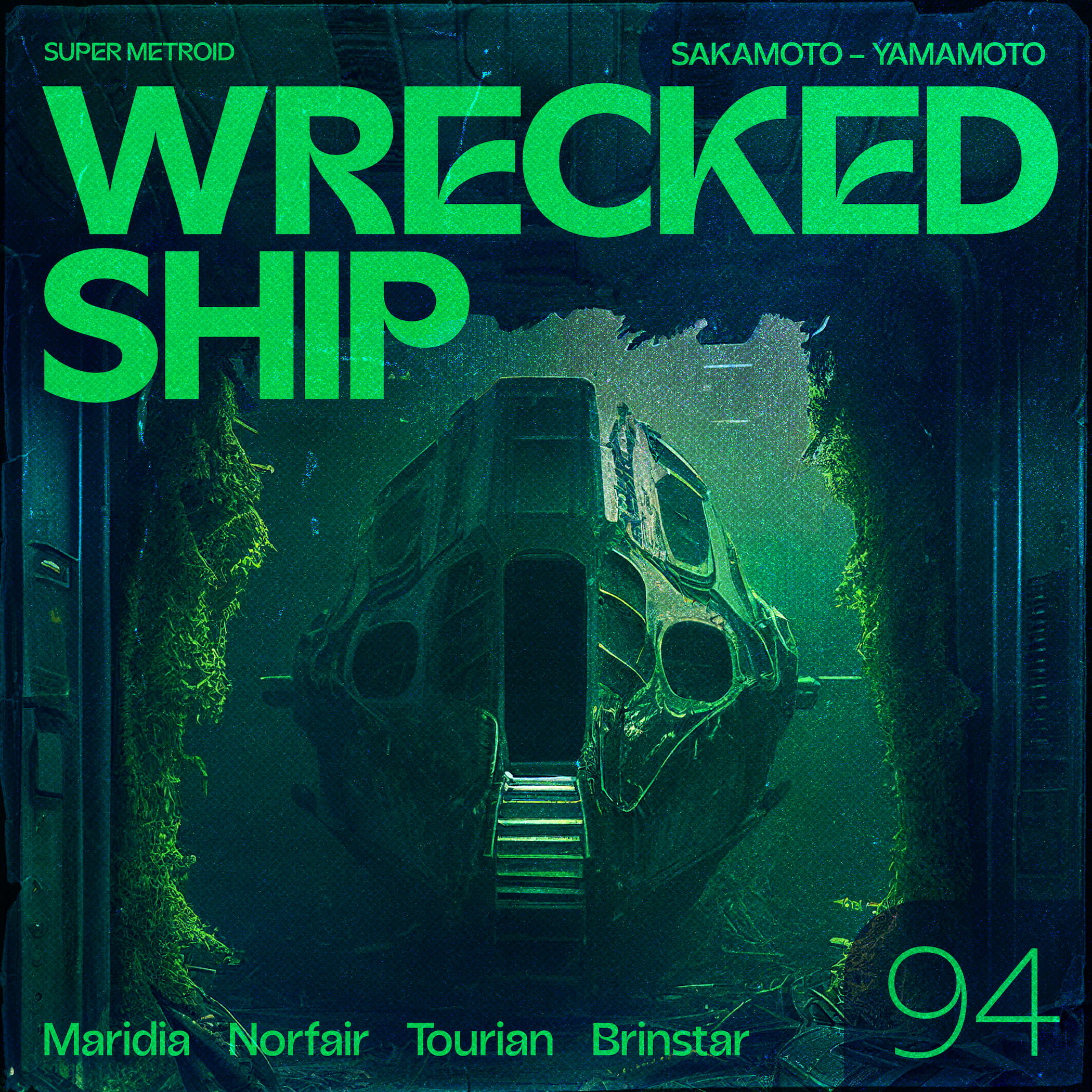
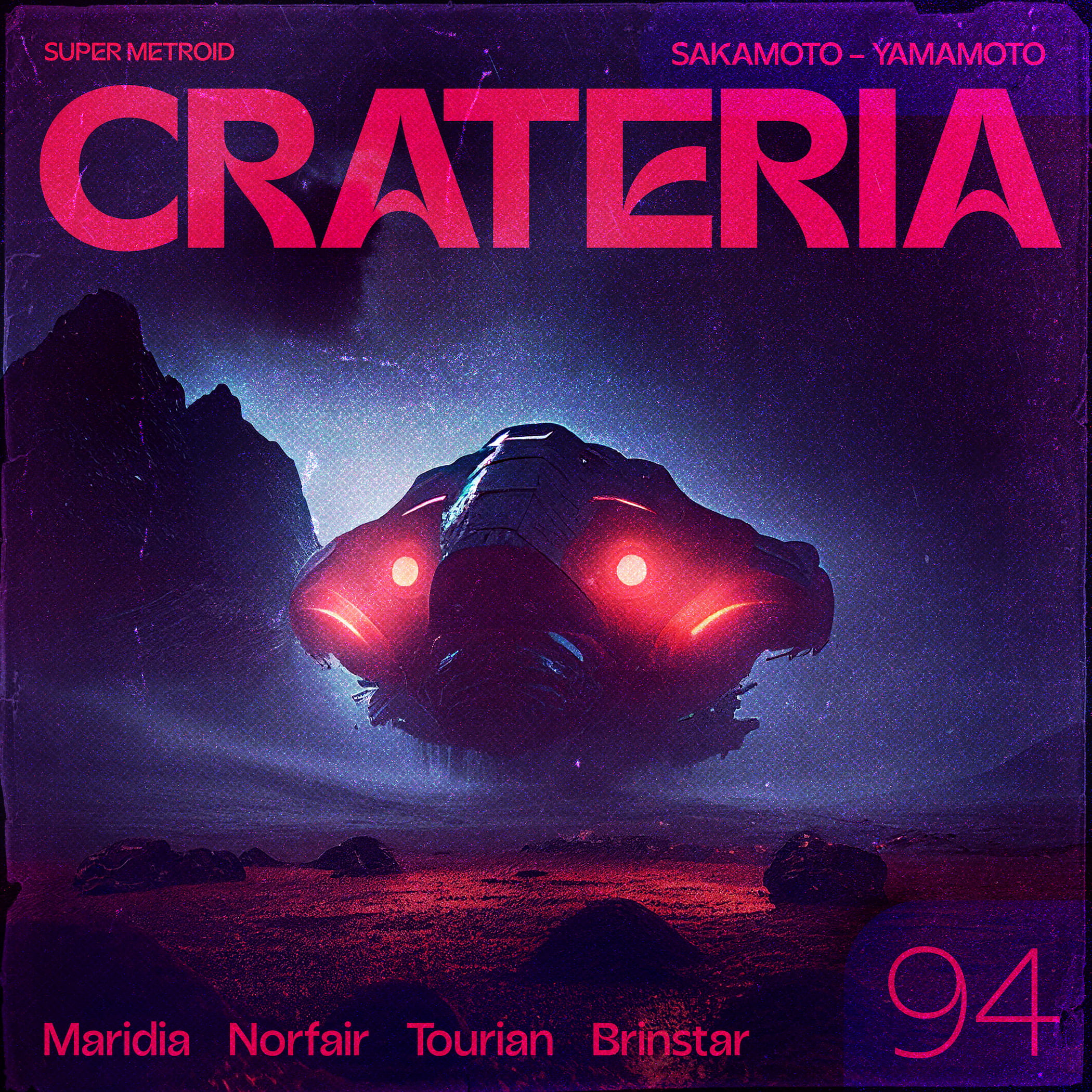
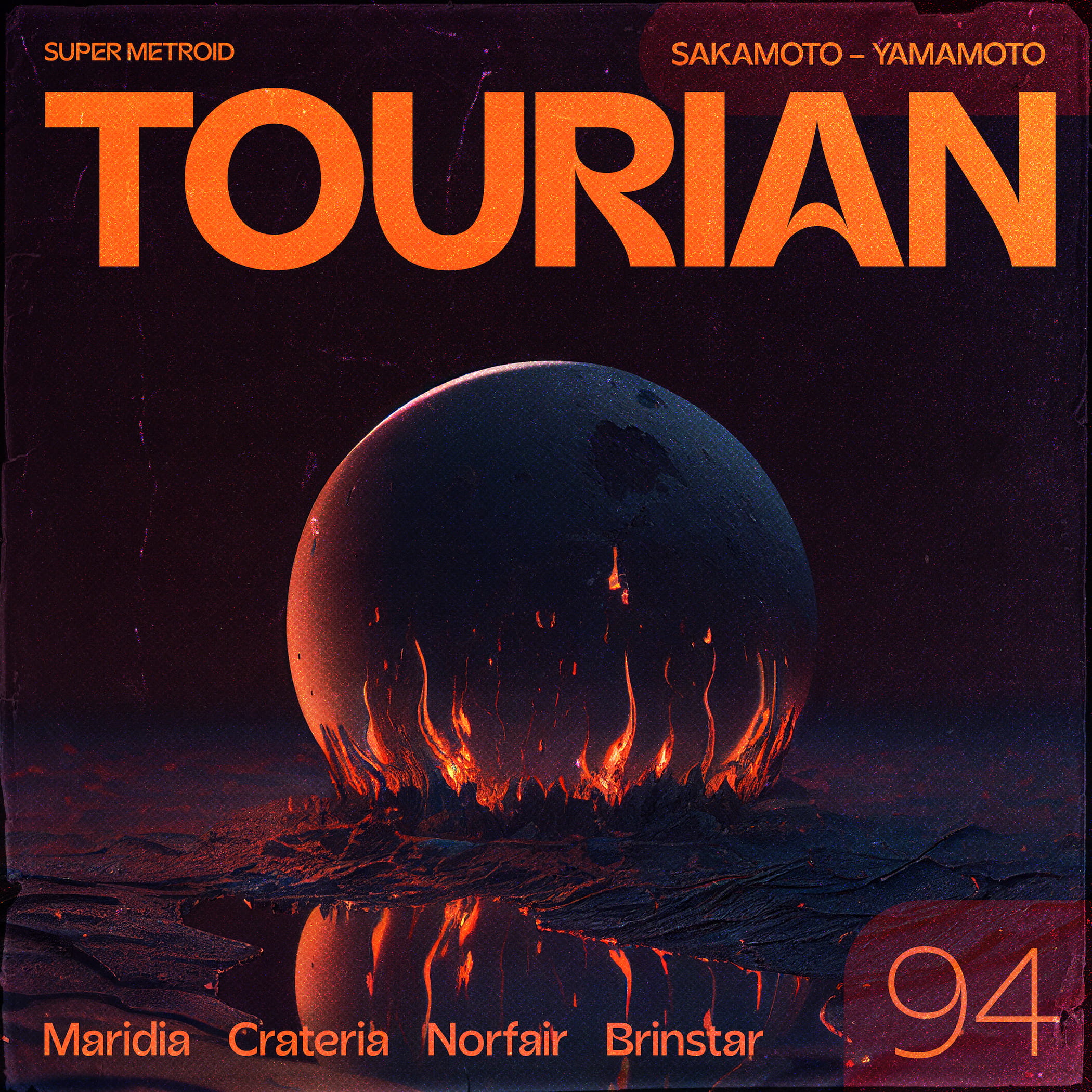
To celebrate the release of the new Beasts of England typeface, Acorn, I made some quick typographic exploration designs based on the key areas from Super Metroid! I’m pretty hyped on how the set turned out.
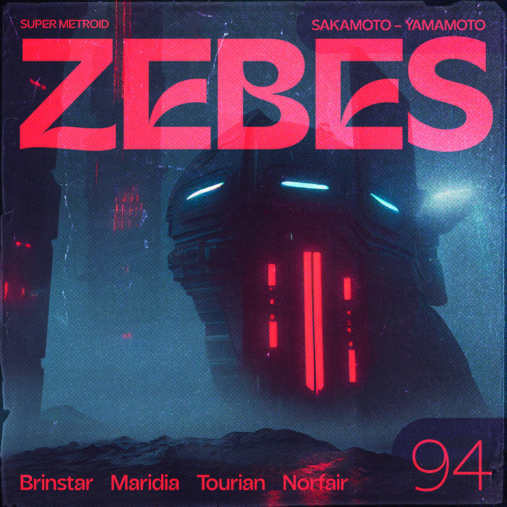
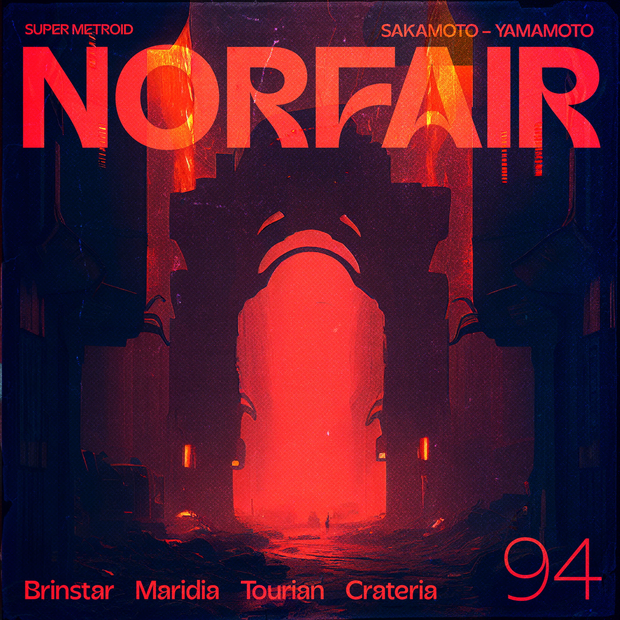
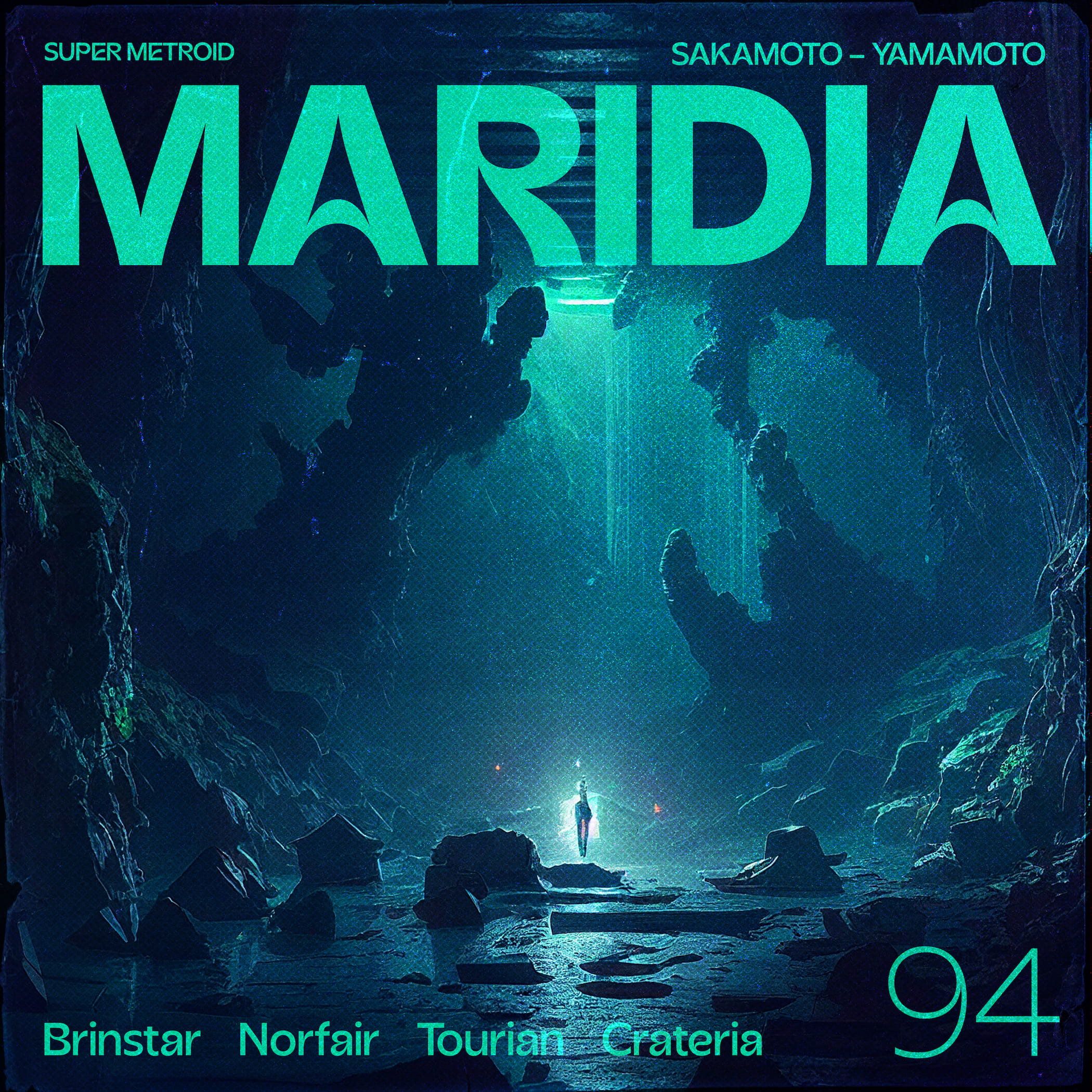
To celebrate the release of the new Beasts of England typeface, Acorn, I made some quick typographic exploration designs based on the key areas from Super Metroid! I’m pretty hyped on how the set turned out.
I’m excited to be releasing a few new tracks over the coming weeks/months.
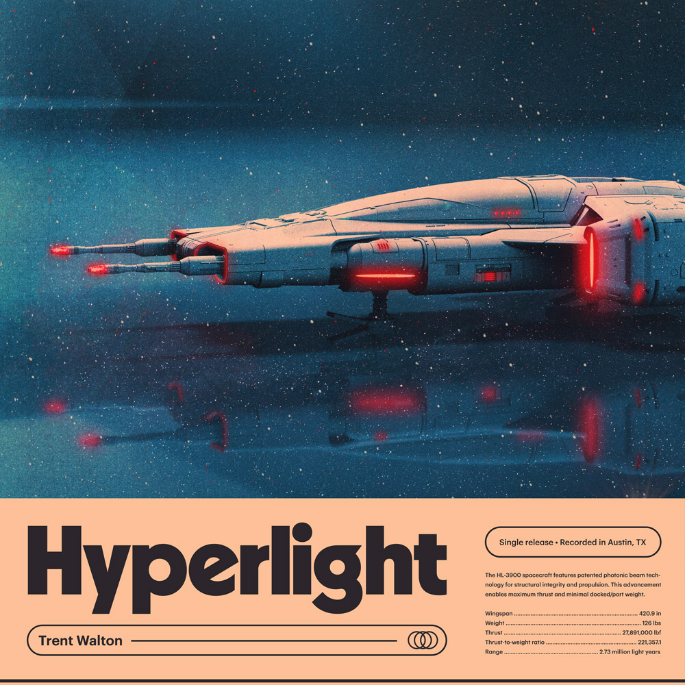
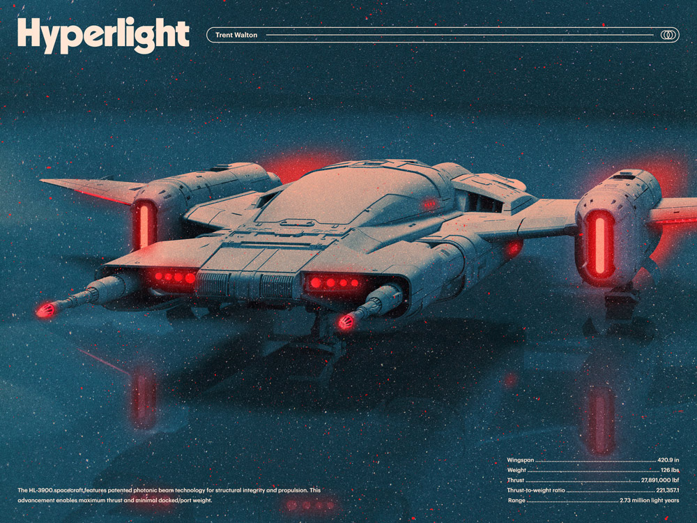
Hyperlight is going to be the peppy/optimistic album starter. Channeling 8-bit NES Rad Racer vibes, I wanted to go for a carefree-cruise-around-town feel. Enjoy, and thanks for the support!
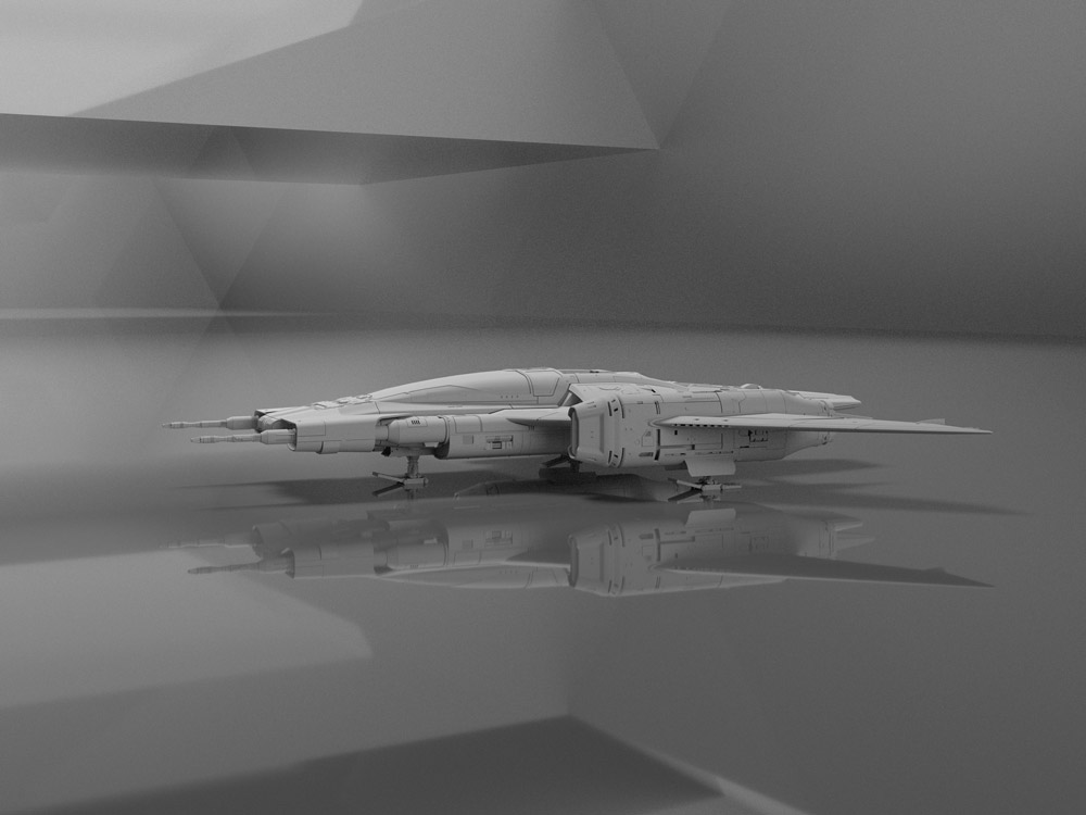
I’m having a blast hacking together 3D models and experimenting with texture, lighting, and of course, type I’ve been digging. More to come.
Back in August I decided I wanted to make an instrumental synthwave album. As trying as the Summer was for many of us, I did my best to take advantage of all time w/ my 8 & 10-year-old boys. We hiked, swam, watched borderline-appropriate movies, and generally had a blast.
At the house we were leasing, my office was right by the long circle driveway. I could hear them outside all day being awesome: racing bikes, climbing trees, busting rocks, sword fighting, etc.
Their radness set the vibe for the album. We even wrote a brief nine-part sci-fi story that went on to inspire each of the nine tracks. I made each song in order according to the plot and would include the boys in layering in some sound effects and voiceover bits.
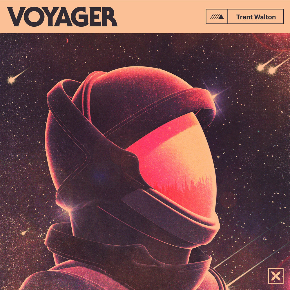
So yay! Here’s Voyager! Happy listening!
I continued doing all the things I love for the album artwork: picking fonts (indulging myself here w/ some ITC Serif Gothic for the title) and making (hacking together) 3D graphics.
I also put together some Spotify Canvas videos—one for each song. Here’s a quick edit showing them all together.
I plan to keep making music. I’ve got a long way to go to gain those 10,000 hours, but I’m having a blast. One day I’d love to find myself making soundtrack music for a show/movie. Heck, maybe my kids will hire me when they get that script we wrote into cinematic production. Anyways, Netflix, give us a shout!
I randomly started making music back in December. At the time, the only place I posted anything was Instagram stories. As short beeps evolved to songs, I built audio.trentwalton.com.
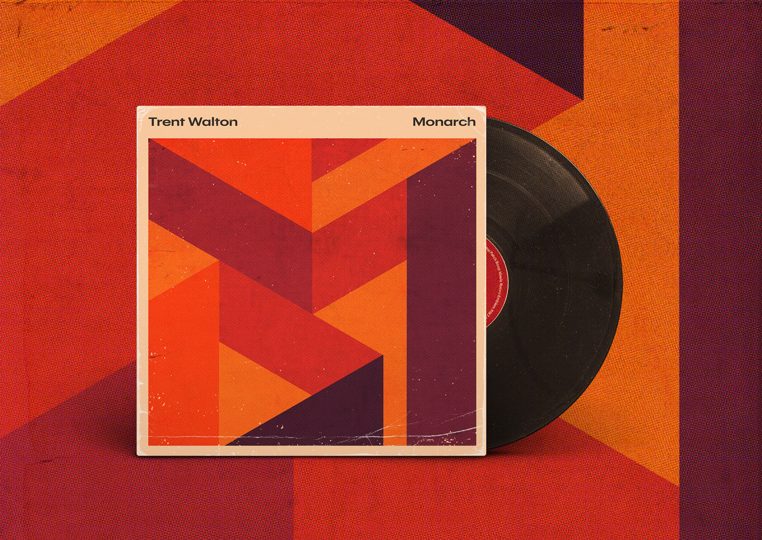
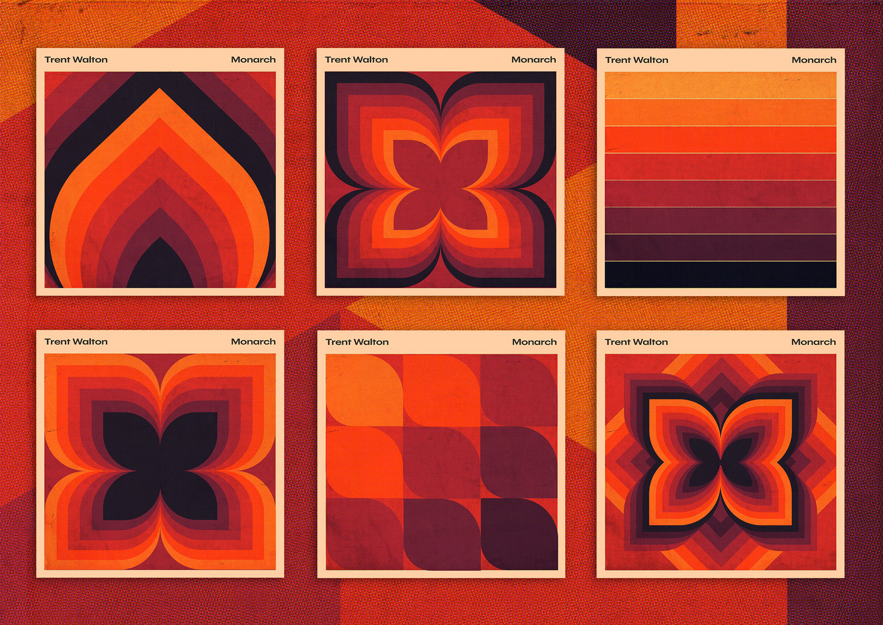
Fast forward to April. When I had 12 songs I was pleased with, I decided to package them up for distribution/streaming. Let this post serve as a mini-release party for Monarch!
Where’d the song/album names come from? The theme for this project was to try and not overthink anything. I’m an amateur here, and while I spend lots of time fussing over details with websites, I didn’t want to do the same with the music.
I rarely edited or revisited songs once they came together, and in Keyser Söze fashion, names came from whatever I saw lying around the office. “Rucco” came from a BOTW Shrine, “Ideals” came from the Ball jar on my desk, and so forth.
The process for the album artwork began with developing a color palette. I assembled some warm tones and played with layer-blending a solid pink/beige block to unify things.
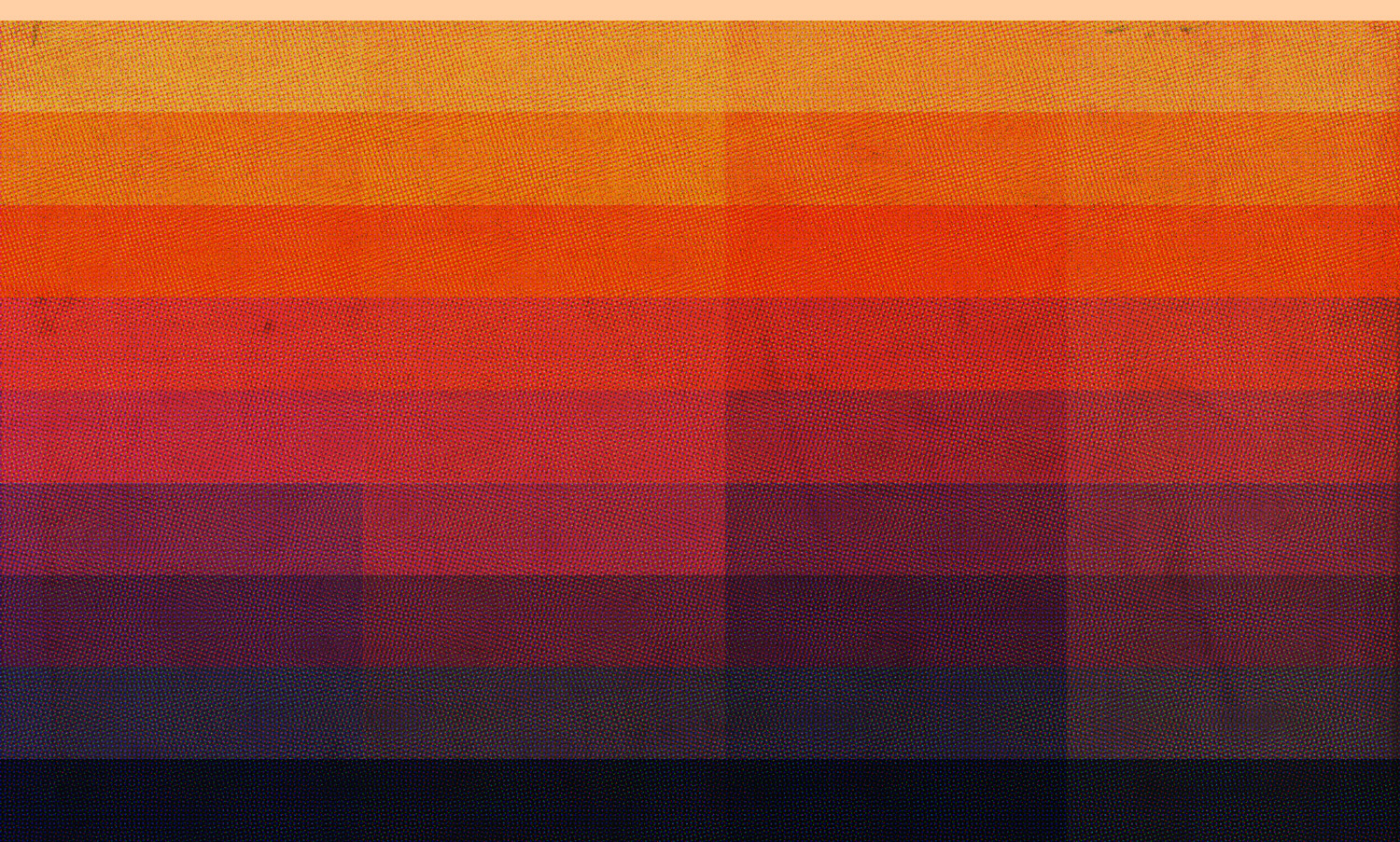
From there, I built some textures by dramatically scaling up image resolution, transferring images to halftone, and then scaling them back down. Gigabytes later, all I had left to do was play with shapes.
I hope you enjoy the beeps. I’ll continue to post MP3s here as they come.
I’m proud of myself because this is merely a post about new fonts rather than a post about a blog redesign. The perfectly-dialed-in textures and vibe from Phil Coffman’s recent redesign nearly pushed me over the edge, though. Anyways, I did what any sensible designer would do after letting the blog sit for too long: buy fonts!
I’ve had Grilli Type’s GT America on my font shopping list for a while. You’re reading GT America Standard Light + Light Italic now, and GT America Mono Regular is sprinkled across tags, meta info, etc.
Titles are set in a variable version of Denso by DSType Foundry who, I’d like to add, were so kind in helping me fine-tune some of the spacing.
With the variable version, you can adjust levels for weight, serifs, and optical size/contrast. I’m still drinking the variable fonts Kool-aid—It’s fun to see the added utility (and kb savings) variable fonts can gain you.
I’ve blogged about this before but wanted to post again now that the 4-season series has wrapped. A consistent detail throughout Mr. Robot was that the title cards seemed to capture the essence of the episode instantly. The (freeze) framing of a powerful image + music + the splash of red type across the screen always got me excited for what was in store.
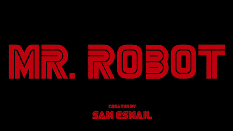
Potential spoilers below, but here’s a video with all four seasons worth of title card intro screens:
I adore the high-contrast type, aged color pallette, and sci-fi concept painting here in the artwork for The Strokes’ new song, “At the Door.”
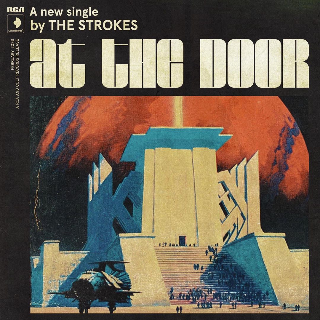
I couldn’t help but track down the title font. I believe it’s Blackbarry NF by Nick Curtis. Then I saw the throwback-Hanna-Barbera-vibed video, which hits even harder. The titles here are set in Angelus Medieval (see also DXAngelus Mediaval).

~4 years ago, we had a sliver of free time at Paravel, and wanted to experiment with creating an immersive-website-book-thingy for Sherlock Holmes: A Scandal in Bohemia complete with a vibey page design, illustrations, animations, and even audio.
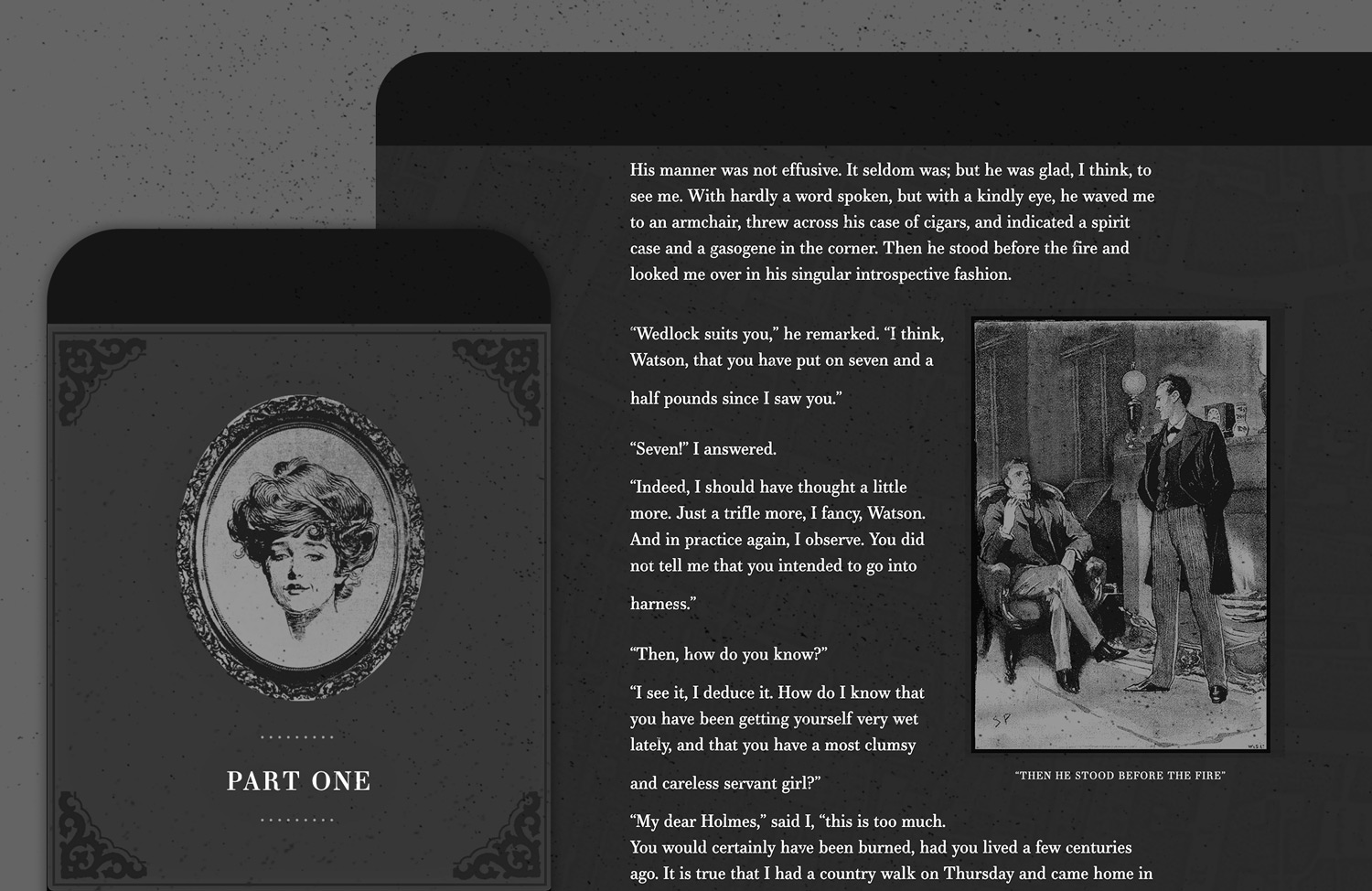
I’m not sure we ever called the experiment done, and we certainly could have spent many more months fretting over all sorts of details. It probably got to a point where the work it’d take to reach the standard we set in our minds far outweighed the joy experienced in the act of creating it. And then we just forgot about it until recently and decided to ship it as-is. Yay!
Yes, there are animations and sounds triggered by scroll (whether or not something is in view). We wanted to play a rain soundtrack when the story mentioned rain. The same goes for fireplace crackling sounds and paper notes sliding into view. Users can still scroll smoothly, and we tried to be extremely subtle about it (which I generally think is the only way to do it).

I knew Dave and Reagan were skeptical about including music and sounds. Still, after some experimentation, I think we found the right balance—ambient tones instead of sharp notes, pulling in looping sounds (like rain) to offset the potential abruptness of a door swinging open, etc.
I also regularly fantasize about being a foley artist and/or making music for TV, movies, or games, so this helped to scratch that itch.
I’ve been lecturing my kids about the importance of output as it relates to creativity. I’ll say stuff like, “I like hearing about all your ideas, but I love it when you turn those ideas into reality even more.” It’s inspiring to see them create tree house models out of boxes and tissue paper, write spell books, and invent comic heroes.
So I’ll be sharing more of my creative endeavors, whether they’re perfect, imperfect, practical, or frivolous. It feels good to get ideas out—to try things because you feel you need to. More to come!