Mr. Robot
I’ve been enjoying Mr. Robot this Summer—It starts with one of the best pilots I’ve ever seen. One small detail that’s stood out for me are the title shots. The music, framing, and oversized logo are just all so epic. Creator Sam Esmail at fastcocreate.com:
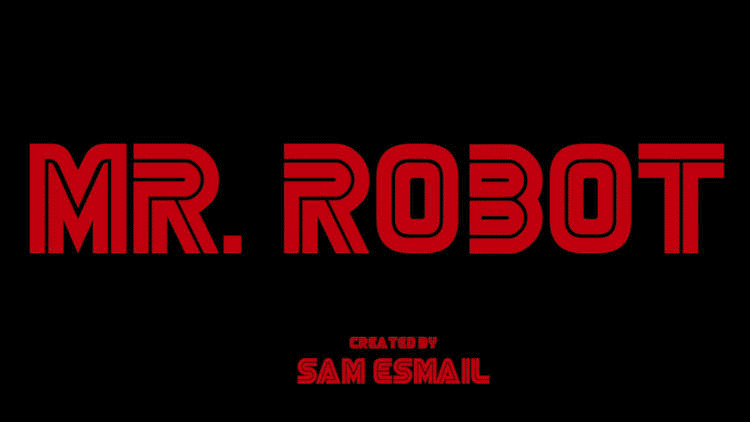
The typeface was the one ingredient about the opening titles that we kept as our flag of consistency. Fonts are something I obsess about constantly. People might find that silly, but for me, everything in a film should be deliberate and designed. This was also something that was going to serve as our signature for the overall series, not just an episode. I must have looked at hundreds of fonts before settling on our current one. I’ve always likened our genre to the paranoid thrillers of the ’70s and ’90s, and this title card checked that box for me perfectly.