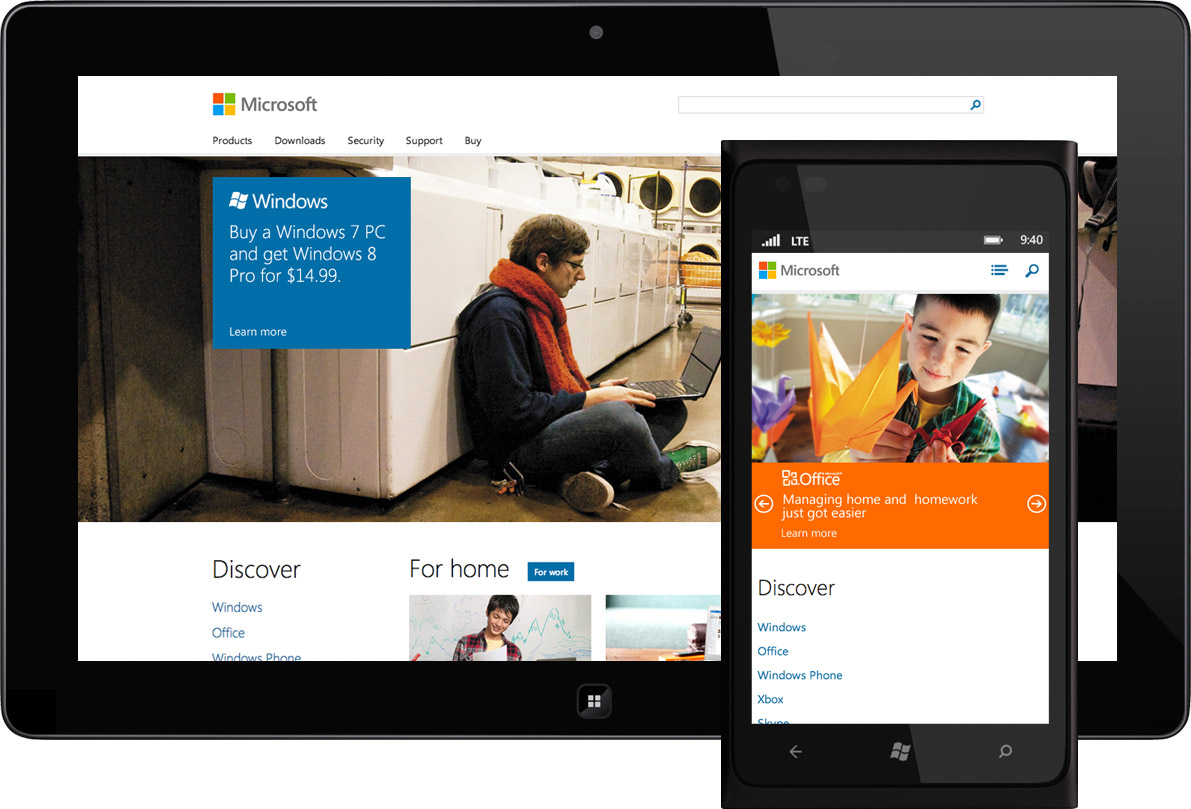
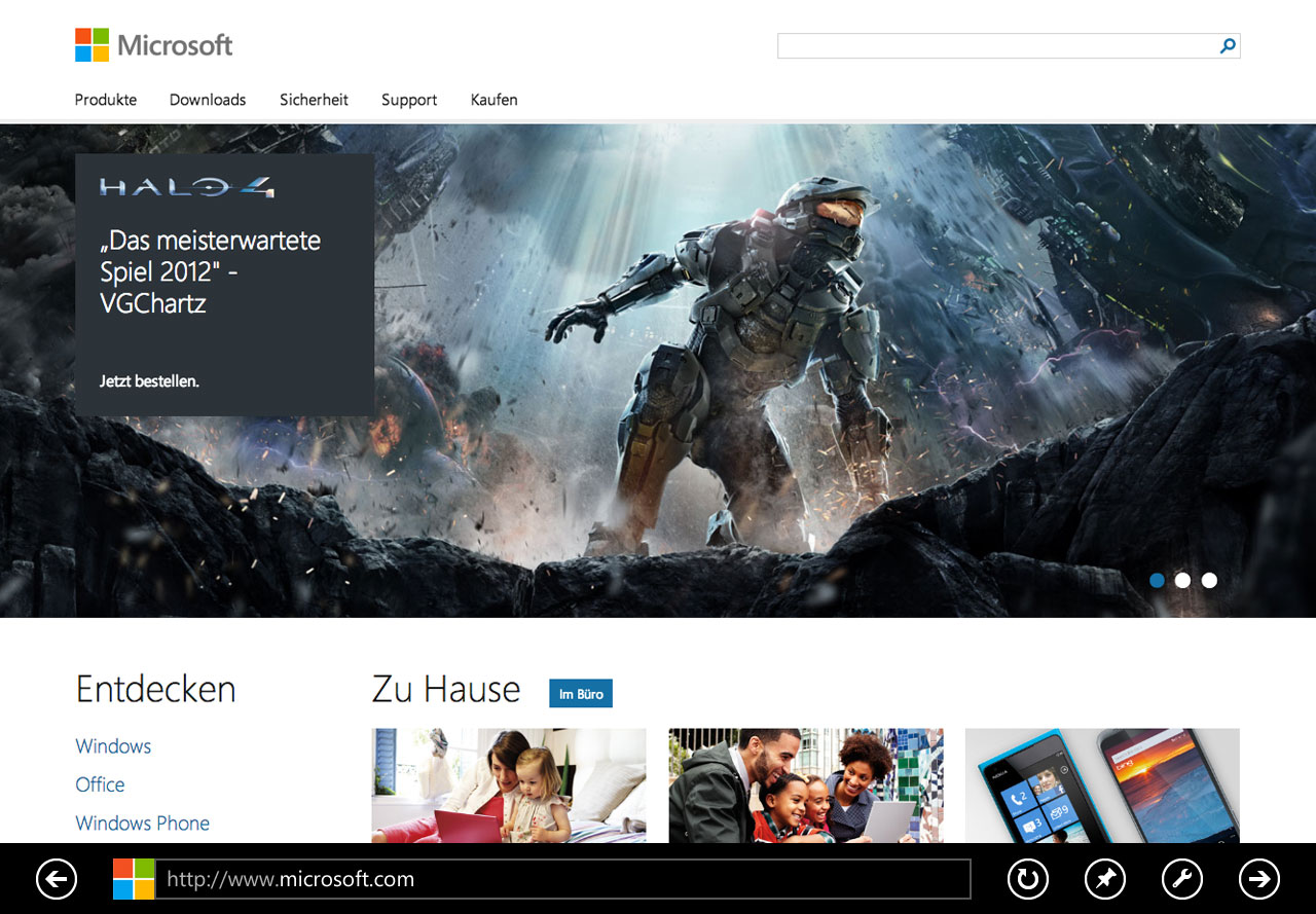
This week Microsoft began rolling out its new responsive homepage—one that Paravel helped design & build.
Earlier this year Nishant Kothary and I were having lunch at SXSW when he asked if Paravel would be interested in working on a responsive Microsoft homepage. I loved the idea. Over the past two years we’d come to believe in the responsive approach and were keen to put it to the test on such a massive scale. Plus, it’s an exciting time to be working with Microsoft. Windows 8 has extended its platform far beyond the desktop in a minimal, type-centric style that aligns with our own design sensibilities. I realized RWD was the perfect way for Microsoft to present itself on the web and that I really wanted Paravel to be involved.
Later, after conversations with Benson Chan (Product Manager) and Pita Kothary (Director of Program Management), Dave, Reagan, and I found ourselves meeting with the entire homepage team, presenting initial concepts. It immediately became clear that they were as excited about RWD as we were and eager to tackle the challenges ahead. Here’s an overview of the work done throughout the project:
Planning & Design
Microsoft has a sophisticated workflow that was finely-tuned for fixed-width mobile and desktop site production. We guided them through the same adaptations we had to make ourselves in order to build responsive sites effectively and efficiently. We used lo-fi mockups to discuss hierarchy, content choreography, and content strategy.
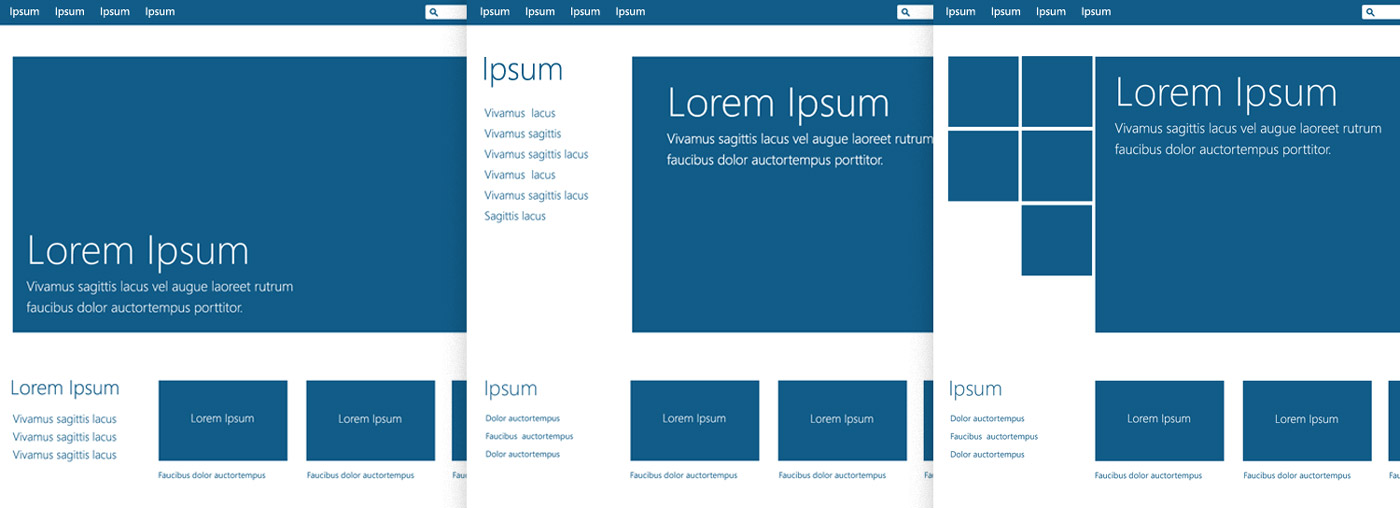
We began fleshing out photoshop comps for 2-3 arbitrary widths (narrow, middle, and full-width). There was a lot of iteration, and we found that this phase was just as much about conversation as it was about the actual design. Weekly reviews involved similar amounts of questioning and debate, which helped to clarify the vision and bring the team together.
Coding for the Preview
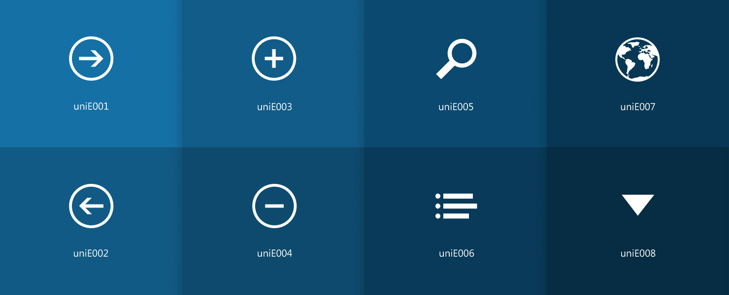
While we’d been coding proofs of concept during the design phase, the time came to build a full, static version of the site to be launched as a preview. We were delighted by how many of our ideas were adopted and assisted by the core team without hesitation. The Windows 8 style (known formerly as Metro) lends itself to resolution independence with its flat colors and reliance on typography, so we built an icon font to take advantage of that. We also spent a great deal of time choreographing how things reflowed across viewport sizes, especially for the hero rotator and navigation menus.
Componentization & Preparation
Overwhelmed by the positive reaction we received during the homepage preview, we set out to prepare the site for its full implementation. After reviewing feedback and exploring some design adjustments, we “componentized” each portion of the static site. CSS was completely overhauled to be more efficient and all front-end code was broken down piece by piece. Things like the hero rotator, news ticker, drop down menu, and even lists of links became their own component—part of the responsive system we were building.
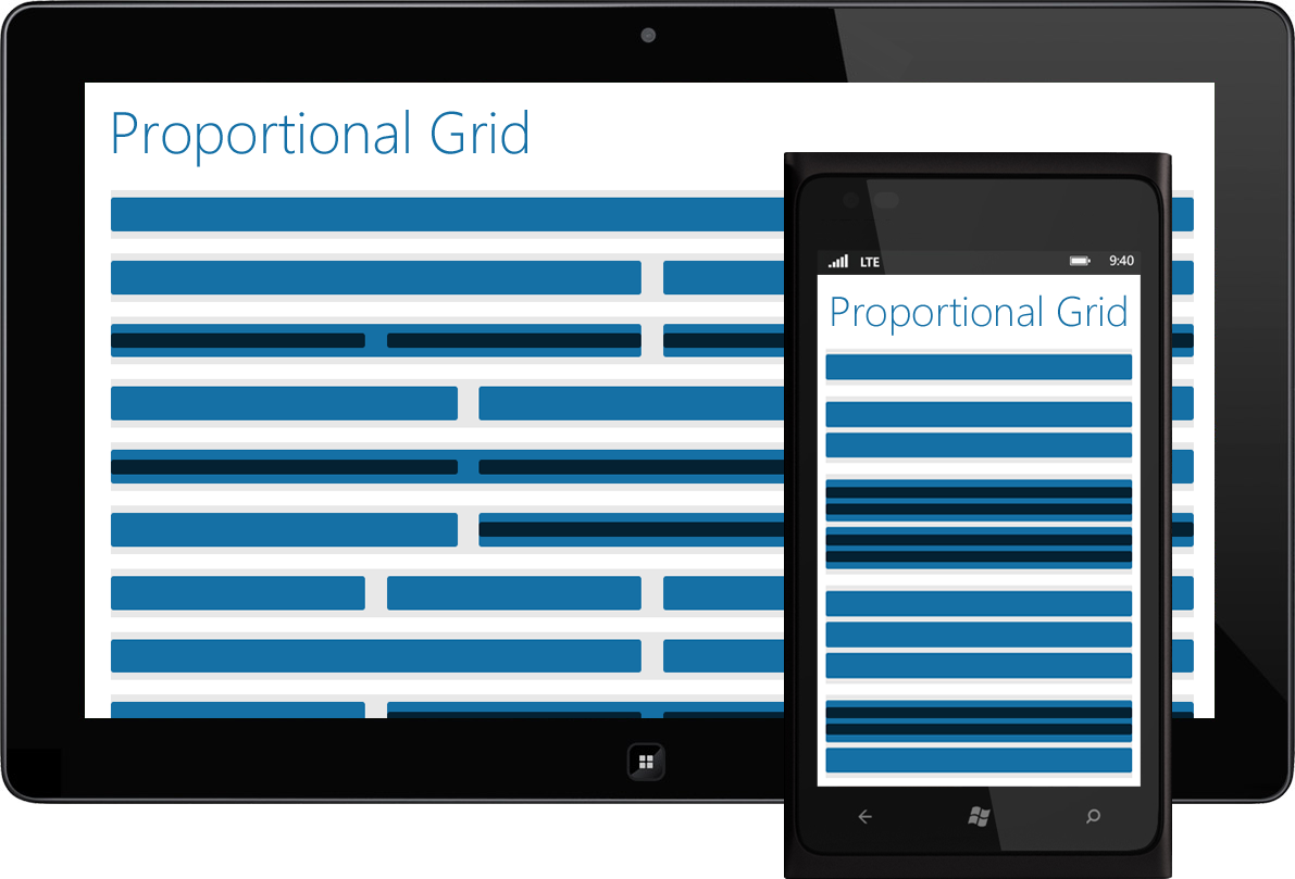
Seeking to make everything as responsive and extendible as possible, we quit thinking about grids Photoshop-first and built a proportional grid in the browser that splits units (and sub units) into halves, thirds, and quarters.
Launch-Ready
At this point we’d locked down components and had the opportunity to help the engineers work their magic—debugging the site with a crack team of browser & device testers (we’re going to miss them on our next project). As the site neared completion, content authors in just under 100 locales began planning content. Knowing the site would be extended to regions that would need extra space for text translations or converted to right-to-left format drove many of our design decisions. It’s a thrill to see the site roll out across the globe.
During this time, we also joined with the templates and components team who will be working to make the responsive assets we delivered available to even more sites within the network. I look forward to seeing what they come up with.
Looking Back, Looking Ahead
When you spend months with a team interpreting stats, debating design decisions, and troubleshooting bugs you really get to know them. Every day each team member worked harder than was expected of him/her. A sense of unyielding dedication tempered with patience and humility was present throughout the project, and I’d like to publicly thank the homepage team for trusting us to take part. It has been an honor.
- Benson Chan
- Bidur Adhikari
- Chris Johnson
- Claire Jennings
- Dave Rupert
- Greg Bader
- Jeff Case
- Joe Chung
- Joseph Ho
- Kalpita Kothary
- Kavitha Mullapudi
- Liliana Aguila
- Michael Ruggiero
- Raju Malhotra
- Reagan Ray
- Steve McGinnis
- Steve Whitford
- Steve Yin
- Tyson Matanich
This week’s launch marks a momentous step for Microsoft and for responsive web design. Rather than waiting for the greater web community to clearly hash out best RWD practices, Microsoft has jumped in early, joining us in the trenches with an abundance of resources and zeal. Thank you, Microsoft—for demonstrating that RWD is the future of the web and that businesses of any size are capable of adopting the approach.
Be sure to check out this post’s companion piece written by Nishant Kothary. In it, he tells the story of how the project came to be, and what its outcome means for Microsoft and for the web.