Embracing the fluid & flexible aspect of responsive web design was an easy decision, but I’ve been less sure-footed when it comes to balancing that with setting type on the web.
From a purely typographic perspective, one could argue that an adaptive approach (where we set breakpoints around fixed-width containers of text to precisely govern measure) is ideal. If a site is only text that may be true, but when images, video, or more complex multi-column layouts come into play, I find my core beliefs in the benefits of building on a flexible foundation reaffirmed. For me, “ideal” on the web isn’t about pixel-perfection anymore, but about seeking the most pragmatic approach to balancing different kinds of content with an ever-increasing number of screen sizes and resolutions.
In a fluid layout, browser width and typographic measure are linked: the wider the viewport, the more characters per line. Keeping in mind that a range of 45-75 characters per line is generally accepted as safe for comfortable reading, there are a few things that can be done to avoid extra long lines of text in fluid layouts.
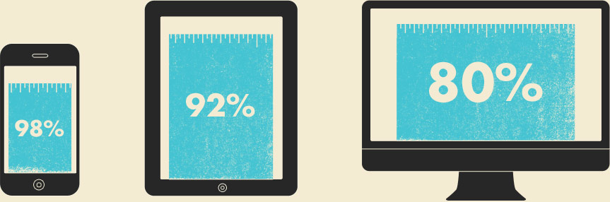
The first is using media queries to adjust the width of a container, whether for the entire site or just a column of text. For example, I might start with a site container width of 98% for single column mobile narrow views, then gradually bump it down to 80% for full-width large screen views. Media query breakpoints and percentage amounts are, of course, dependent on the content and typefaces involved.
The next thing I adjust at wider views is font-size. I’ll check paragraphs to see if the layout is blowing out the characters per line at any given width. When it does, I increase the font-size until things are back in that safe 45-75 range. A simple, effective trick I’ve used is dropping some lorem text into the layout with two asterisks. The first marks the 45th character, and the second marks the 75th. See below at various widths:
Lorem ipsum dolor sit amet, consectetur adip*isicing elit, sed do eiusmod *tempor incididunt ut labore et dolore magna aliqua.
As I widen the browser window, if at any point the two asterisks appear on the same line of text, I know it’s time to increase the font size. These adjustments are easy (usually 1 CSS property) because I’ve used percentage, em, and rem (not pixel) units in my CSS.
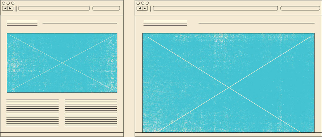
From there, I tweak ’til I go cross-eyed. I’ve also been peppering in things like CSS column-count to split paragraphs in two or three at wider views. It doesn’t make sense within all layouts, but it’s easy to drop in and experiment. See below at various widths:
Lorem ipsum dolor sit amet, consectetur adipiscing elit. Fusce eget mauris dolor. Mauris dictum sapien nec ante fermentum mattis non a libero. Nam vitae mollis mauris. Vestibulum augue ante, pellentesque sit amet bibendum ac, convallis nec lacus. Cras vel ipsum metus.
That’s my approach to fluid type today, but this is completely malleable. It was a little different a week ago and will hopefully evolve with the web and all the devices we’re to accommodate in the future. Here are some of the key things I find myself waffling on, especially when it comes to wide views.
Is there a font-size ceiling?
Every month or so, I’ve been increasing the font-size on the blog via horizontal and vertical media queries for viewports that are maxed-out in size. I started going from 18px to 20px, then went on to 22px, now 24px. I’m definitely not under the illusion that everyone likes the same thing when it comes to font-size or type in general. Setting type on the web can feel a lot like grilling a steak in front of a crowd of your pit master friends. Everyone has his own opinion, his own bag of tricks. I, for one, like the large type at wide views. I’ve seen multiple people reading the same site from further away, and I can imagine someone leaning back rather than craning his neck forward so this 20+ font-size makes sense to me, but…
Are there some text faces that don’t look good large? To my eye, Meta Serif handles the extra size just fine, but I can imagine that some text faces simply weren’t built for larger sizes or even pixel-dense screens. I’d love to get a type designer’s opinion on that. Perhaps it’s all subjective, but I’d say I’ll always be happier with how large type looks & reads vs type that is too small.
Can we count on context? Can we assume that everyone holds a phone or tablet at the same distance, or that desktop browsers are all hunched over a desk? I don’t think so, and the width-based approach I described earlier works well for scaling font-size. Until computers sense a user’s reading distance and adjust page scale proportionally (sounds like a nightmare, right?) we’ll have to make these sensible generalizations. I think it’s safe to. It’s the responsive way.
Panoramic Viewports
How wide is too wide? When do things get so wide that looking left and looking right becomes a chore? I’m not sure, but I’d argue this is another context factor. The further away I am, the smaller the type will relatively appear and the less distance I have to travel from left to right. 1000px + views have been the trickiest to determine. If you scale things proportionally, sooner or later everything is going to be pushed out of the initial view, and while “the fold” doesn’t rule my world, it’s something I think we all consider.
I still set a max-width on most sites based on content considerations. How large should images be? When does the site look awkward & disjointed? When do things get too large? Is it appropriate to slide this layout’s columns out into additional sidebars à la John Hicks? And maybe going super-wide isn’t a necessity at this point in time. I really like the border Frank Chimero has on his site. He’s got a fairly standard max-width being applied and uses the colored borders to help pull focus back towards the text, adding edges to the page.
Fully-Fluid Type
I use FitText on every article title on this site and have used it on client work from time to time, but since reading Chris Coyier’s post (and watching the video) I’ve been excited for viewport sized typography. CSS3 has some new units of measure:
- vw: each unit is equal to 1% of the width of the containing block
- vh: each unit is equal to 1% of the height of the containing block
- vmin: each unit is equal to whichever one is smaller
Like FitText, font-size would change depending upon viewport & container size. It’s a little intimidating to imagine this applied to an entire site. For example, what happens if I overlook some smaller figcaption text, and it renders at 4px on mobile? But this, like anything else, will take some getting used to. I think the more we work with these units, the more useful they’ll be. It’s only supported in Chrome at the moment, so we’ve got time. Dave Rupert even mentioned that in the future, he’d like to see about evolving FitText into a polyfill for these units. What can I say, we love it when CSS renders our tiny jQuery plugins obsolete.
So much of this territory is uncharted, and I’m always interested in others’ approaches & opinions, so feel free to chime in with yours. It’s been hard to let go of setting a static font-size for a site and calling things done. I’m realizing that the predictability & control we’ve had over web type is becoming a thing of the past. With everyone working together, from type makers to web designers, sharing ideas and trying new things will help to ensure the web becomes an increasingly enjoyable reading experience for all.