BuildWindows.com
Earlier this week the responsive website for Microsoft’s 2012 Build Conference went live. Happily, our favorite honey badger, Nishant Kothary, enlisted Paravel to assist with design and the front-end responsive code. Check it out!
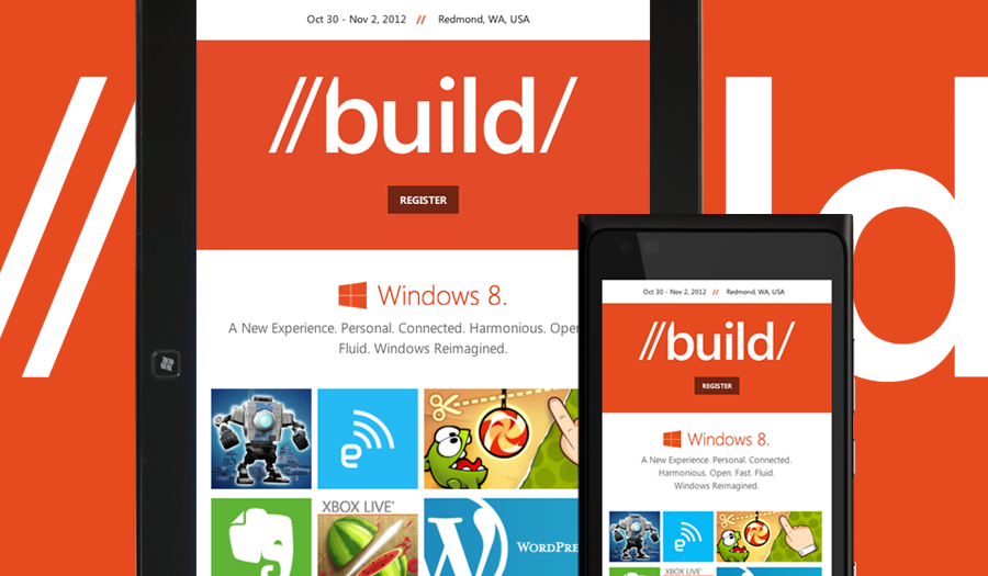
When someone is as good at as many things as Nishant, it’s easy to forget that he’s also an amazing designer. His lead on content and information architecture made our job a breeze. Reagan collaborated with Nishant on fleshing out the layout while Dave and I coded the front-end. Be sure to check out some of Dave’s metro-esque CSS & JS animation work throughout the page.
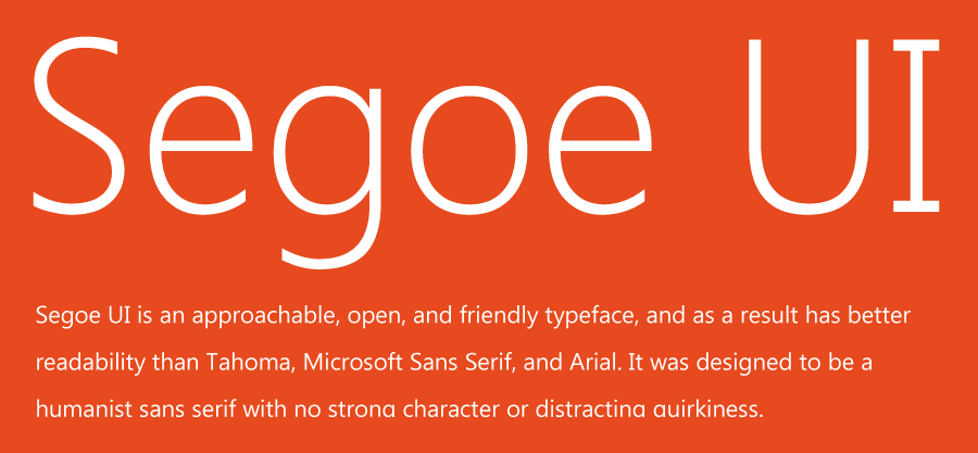
I had a great time working with Microsoft’s humanist sans typeface, Segoe UI. It scaled beautifully as we increased body font-size from 16px to 32px at wider screens. The resolution independence of the Metro design aesthetic combined with Segoe’s flexibility inspired us to think just as much about extra wide viewports as we did narrow ones. Our widest min-width media query triggers at 1950px.
With each responsive project Paravel completes my perception and approach evolves. This time around I realized that my favorite part of the job is now all the content choreography & media-querying. Whereas code used to be pure execution for me, now it’s where I feel most creative and inventive. Furthermore, I’ve found it near impossible to evaluate the quality of a responsive design outside of the browser.
Lesson learned: Get it in the browser as soon as you can (if you don’t start there). Then, iterate like mad with a team you love to work with. Gosh. I can’t remember a more exciting time to be a web designer.
Also, be sure to check out Nishant’s write-up as well as the other versions of the site for before and during the event.