CSS Off
Gene Crawford from UnmatchedStyle asked Paravel to design a page for this year’s CSS Off competition. Over 5,000 front-end developers have entered to show off their skills by taking a PSD we designed and coding it out. Entries will be judged and prizes will be awarded. Awesome!
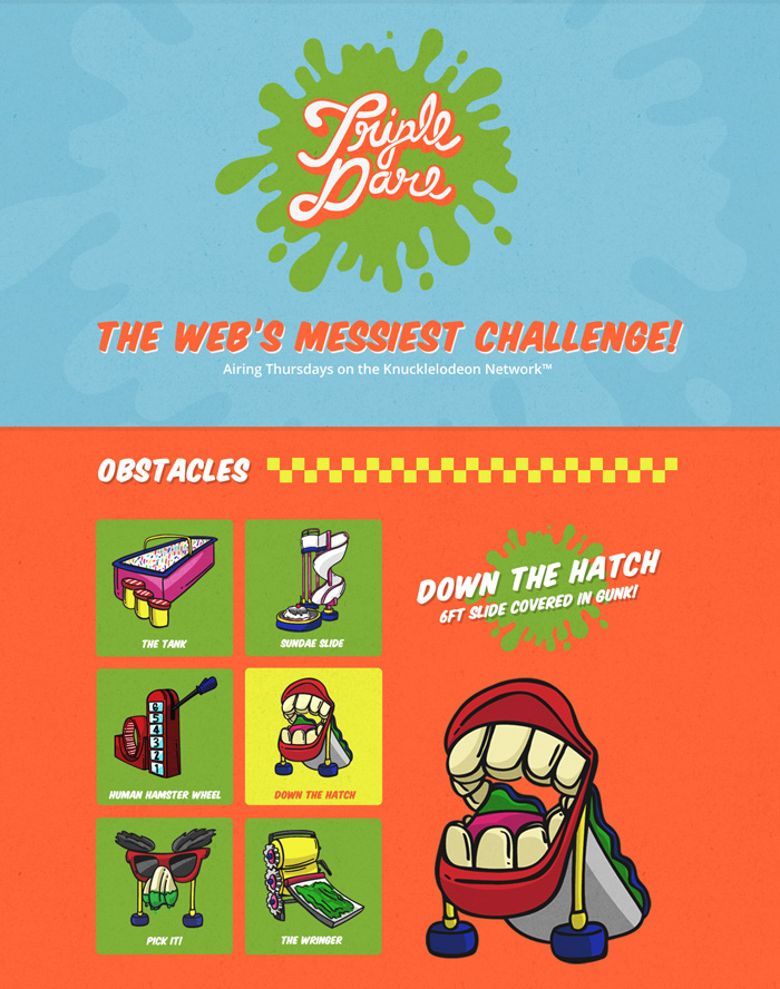
After a morning of team planning and intensive YouTube research, we settled on building a page for a fictitious gameshow on the Knuckleodeon Network called Triple Dare. Reagan put together some fantastic illustrations, and I designed them into a layout that I hope leaves lots of room for code-out interpretation. There are quite a few places where interesting animations, transitions, transforms, and interactions could be built in. Heck, this thing could also be built responsibly... I mean responsively... I mean both ;)
Be sure to read Reagan’s post to get the low down on his illustration process. We’re all very excited to see what people come up with. Happy front-ending!

8 Responses
Leave a comment or contact me via Twitter @TrentWalton
You guys didn’t disappoint! Of course, there really was never any doubt. :) Great job!
I know it’s not really the point of the exercise guys, and I feel a bit of a tool for making such a point about it, but you’ve chosen a completely terrible colour pallet for about 7% of the male population - who happen to be red/green colour blind.
The point of the exercise isn’t the design, I know. But this is a really bad example to throw out there of what an acceptable design to code might be. You know what I see for that design? A mess with no contrast. The only think that gets my attention is the yellow square. The rest is a flat smudge of the same brightness and same tone.
Basic accessibility in design is not being followed here: this hasn’t been run through a colour contrast checker has it?
@Matt Wilcox: A 100% valid point. Because of the playful nature of the contest we designed something completely off the wall & silly without a ton of planning. Thanks for raising this issue though. I wonder if it’d be possible to increase the contrast in the design to suit your needs and build things out that way. Perhaps it’d help bring more attention to the cause.
Even more shocking is that a competition judging the quality of front-end code does not have anywhere in it’s scoring system “accessibility”. Which decade are we in again?
@Matt Wilcox: After taking a look at the mockup with Color Oracle, I’d concede the color palette isn’t beautiful, but all illustrations and text are easily visible.
http://cl.ly/0s1Q0L093l413n1c3n2I
http://cl.ly/1H223P0O012j151E2032
http://cl.ly/1q162u42022G3a0R093D
Thank’s for recognising it as an issue, but given the objective of the competition - which is I assume to celebrate modern methods and tell people how well they code a modern website - I find the lack of any accessibility criteria or consideration so flawed as to make the thing essentially worthless.
Accessibility is not an “option” or a “nice to have”, it’s a requirement for any person wanting to be considered competent as a front end coder or designer on the web today. It’s not just morally required, it’s legally required. I don’t feel it should be up to contributors to address this, I think it’s vital for the credibility of the competition itself for it to be a criteria people must adhere to.
Agreed, it’s not unusable as a design, but it’s not at all pretty and clearly hadn’t been checked.
FYI, one that really is a problem for you is the footer links on the competition website. Red/orange text on a green background. It makes my eyes go crazy trying to read them.
Though the design is totally outrageous, I like it. It’s not the run of the mill boring box stacked on box. Good job.