CSS Webkit Appearance
I did my fair share of testing this site on an iPad during development. In most cases, the version of Mobile Safari found on the iPad renders pages like any other standards-based browser. Only when I got to native UI elements like search boxes & text fields did I notice an inconsistency. A pre-set styling was being applied in the way of an inner shadow to text input fields and a gradient overlay to search / submit buttons, which also got rounded corners.

After picking through Safari’s CSS Reference I found -webkit-appearance, which changes the appearance of buttons & controls to resemble a native apple UI. I added this code for comment & search forms to retain the basic style I defined in my CSS: -webkit-appearance:none;
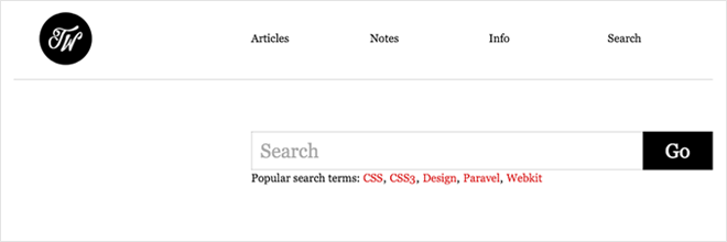
There are quite a few parameters for this property that you may want to take advantage of and/or watch out for. Also, If you simply wanted to disable inner-shadows of input fields you could just use -webkit-appearance:caret;.
- button
- button-bevel
- caret
- checkbox
- default-button
- listbox
- listitem
- media-fullscreen-button
- media-mute-button
- media-play-button
- media-seek-back-button
- media-seek-forward-button
- media-slider
- media-sliderthumb
- menulist
- menulist-button
- menulist-text
- menulist-textfield
- none
- push-button
- radio
- searchfield
- searchfield-cancel-button
- searchfield-decoration
- searchfield-results-button
- searchfield-results-decoration
- slider-horizontal
- slider-vertical
- sliderthumb-horizontal
- sliderthumb-vertical
- square-button
- textarea
- textfield
45 Responses
Leave a comment or contact me via Twitter @TrentWalton
Interesting! Just fixed this on my new site :) Cheers!
I did not know that! Thanks. :)
Thanks for the great info, Trent. I have implemented this on my blog today, as this is something that has bugged me about the iPhone browser.
The more you know. Thank you.
That’s awesome! Does it get rid of extra paddings and outlines too?
Do you know if there’s any similar solution for Mozilla browsers?
For Mozilla browsers, to get rid of that awful blue outline on links (for example, if an image is used as a link), add border-style: none to your CSS. Here’s an example of how I handled it from my site: img { border-style: none; -webkit-transition: all 0.5s ease-in-out; -moz-transition: all 0.5s ease-in-out; }
I’m sure though, that there are other (maybe better) ways to do it. :-)
For a button, you may also want to make the outline: 0px.
Example:
HTML -->
CSS -->
#search #submit {border: 1px solid rgb(88,129,170); background-color: rgb(88,129,170); outline: 0px; padding: 5px 10px; color: rgb(255,255,255); border-radius: 5px; -moz-border-radius: 5px; -webkit-border-radius: 5px; font-family: ‘HelveticaNeue-Light’, ‘Helvetica Neue Light’, ‘Helvetica Neue’, ‘Helvetica’, ‘Arial’, sans-serif; cursor: pointer; font-size: 12px; text-shadow: 0px 1px 1px rgb(22,22,25); box-shadow: 2px 3px 3px rgb(22,22,25); -moz-box-shadow: 2px 3px 3px rgb(22,22,25); -webkit-box-shadow: 2px 3px 3px rgb(22,22,25); font-weight: bold; margin-left: 5px; -webkit-transition: all 0.2s ease-in-out; -moz-transition: all 0.2s ease-in-out; -webkit-appearance:none; }
@Steve: I was talking about browser-specific proprietary styles for form elements. For instance, in Firefox, buttons and submit inputs have a “inner outline” when focused and extra padding even if you reset outline and padding for the element, pretty much like Safari forces a default style that matches the aqua theme.
I’m looking for an easy way to reset all these browser-specific proprietary styles in Firefox just like the -webkit-appearance selector does.
Well, I just found out that there actually is a -moz-appearance selector that does exactly the same. Now I’m good to go! ;)
Source: https://developer.mozilla.org/en/CSS/-moz-appearance
@Rafael: I see what you were asking about now. My bad on that. Thanks for the link. Very informative.
I’m having a strange problem with . When viewing my page on Windows Safari, I see the [X] (searchfield-cancel-button), it works as expected. However when I view the same page on the iPhone, Mobile Safari, the [X] button is not there. If I add more margin-right to ‘input[type=“search”]::-webkit-search-cancel-button’ I can tap the invisible button to get the expected functionality.
Any suggestions?
When I use the “caret” value, it does get rid of the inner shadow and looks perfect on the iPad… but on the desktop versions of Chrome and Safari, my textarea/input borders are gone.
On the other hand, if I use the “none” value, on the iPad it no longer applies my focus (pseudo-class) styles when a textarea/input is selected. It kind of ruins my form styling because textareas/inputs not in focus are significantly subdued.
Is there a way to get rid of the inner shadow without breaking the focus pseudo-class? I know I can have a separate stylesheet for the iPhone and the iPad, but I’d like to keep things simple(r) if possible!
I found a temporary solution: http://stackoverflow.com/questions/2839618/iphone-web-app-typetext-inner-shadow-issue
It works. : )
@David Quinn Carder: So that worked for you? Thanks for following up!
.textBox input { border:none;}@Trent:
I didn’t make it clear with my link (sorry), but the solution that worked for me was this:
input, textarea { background:url(transparent.gif); }
It’s the only fix that worked across all browsers without breaking :focus on the iPhone/iPad—and to clarify, it did not simply override my :focus style, it disabled the :focus function altogether, which is obviously a usability concern.
I love the look of this site, by the way!
man i have been racking my brain about this one, thanks!
Here’s the editor draft spec where appearance is defined:
http://dev.w3.org/csswg/css3-ui/#appearance
Safari on the Ipad changes an asp.net listbox to a dropdown. Is there any way to prevent that from happening? Also, when you click the down arrow, the text displayed is truncated at about 30 characters. This is annoying.
When is Eric Meyer going to add this to his CSS reset? It’s a real pain.
Oh, we’re Apple, we’ll just change all your design ’cause you’re all idiots and we’ve published Human Interface Guidelines. Nah nah ne nah nah.
Dicks.
@ David Quinn Carder
Thanks, man !
This drove me nuts !!!!
You made my day. :D
Thanks for figuring that out. Pretty clean fix. I’m trying to get rid of the arrow in the select option fields in Firefox but -moz-appearance: none doesn’t seem to work. Any suggestions for that?
Regards,
Denis
Another one to watch out for is -webkit-text-size-adjust. The iPhone browser automatically sizes up text for readability, but on a fixed width site it can give you all sorts of blowouts.
Beautiful. Thanks for the solution, works like a charm.
Sweet !!! Blasted phantom “border” looking thing on input field has been killing me for months and this did the trick. Thanks a ton.
Seems like if we could disable the thing altogether, instead of having to redefine it... Webkit is nice, if you’re in a hurry. But it looks like crap, to be honest. If you want conformity in a set of buttons, why not at least make them look good?? I can’t stand the look of the standard button set, so always end up changing it. Always. So then I have to track down all my: input[type=“button”] or whatever. Why am I fighting my browser? Ok, I’m a little crabby right now... hate wasting my afternoons tracking these things down. Need to write my own webkit tool box or something.
Hey. Great tip. I wanted to mention that rounded corners still show up in iPad with -webkit-appearence:none. Your use of -webkit-border-radius: 0px; solves that problem. Tip - no need for units if the number is 0.
Thanks. Fixed my readonly input issue where I wanted no border, just the text.
Thanks, great tip!
Hello,
Thanks for the tip! But like RAYMOND SCHWARTZ mentioned.
For me it wasn’t enough with the webkit-appearence:none
to get rid of the round corners in buttons and fields in iPad. That only worked in my computer’s Safari browser.
I had to apply -webkit-border-radius: 0px;
for the iPad issue, and that worked as a charmed :)
// Happy coding everyone!
Thanks for suggesting the quick fix. It helped me a lot.
Dang it all! After a few hours sifting through chromium issues, messing around on jsfiddle with a slimmed down test case, reading google search results I finally get a link from a comment reply on csstricks.com leading me here for the solution. Boy are my arms tired. WACKAH, WACKAH!
Seriously though, I’m trying to wrap my head around the thinking here. Certainly consistency across the board is a factor and if that were the case Mozilla would be the same as well -but they’re not! Maybe its time we decide whats the best options for for input styling.
Thanks for the great tips and research into Safari’s CSS reference on this daunting and delightful subject :)p
Just spent a few hours with
input[type="search"], --webkit-appearance: none,paddingplustext-indentand I don’t I have anything remotely good to say about any of them right now (at least nothing longer than four words). I Experienced peculiar results with styling so I’m going back toinput[type="text"]for search forms until the consistency can be in place. The search attribute just wasn’t playing nice between Chrome, Safari for Lion and iOS5 for the iPad2 - styling-wise.i have just add
body, div, h1, h2, h3, h4, h5, h6, p, a, span, label, input, textarea, select, img, table, th, tr, td, ul, li {
-webkit-appearance:none;
}
to my main.css. but i lost arrows for select elements on chrome. any idea?
@Emirhan: None off the top of my head... is there an example online somewhere?
@Emirhan: Don’t use a jackhammer when a ball-peen will do. Add “-webkit-appearance:none”, and/or “-webkit-border-radius:0″ to only the specific elements that you want to change.
Or, even better, use a media query:
@media screen and (max-device-width: 768px) {
...your styles...
}
This will apply your styles only on iPads.
Hi Trent,
I ran into the same problem and have put a demo here:
http://www.basereality.com/demos/webkitAppearance/index.html
The same shiny effect occurs on the styled selects in both Chrome and Safari running on a MBP. Looking at the ‘computer styles’ in Chrome, there doesn’t appear to be any that could be set to turn the effect off unfortunately.
@alasdair: Too True!
It’s an easy fix once you know about it, thanks for sharing this Trent. Spreading awareness is a great service!
Hello ! Your solution works well for safari on ipad, but Chrome (ipad), it doesn’t work... Others solutions ?
Thanks - this was really helpful in a (frustrating) pinch!
For all of you guys wondering on how to hide the select element arrow on Firefox using -moz-appearance:none; here is how to do it: https://gist.github.com/joaocunha/6273016
If you apply -webkit-appearance:none to checkboxes & radio buttons, note that they won’t show their selected state...
Not sure of the fix, that’s what I was working on when I found this post.
Hi Tom,
Dis you got solution for ios cancel button ??
did you got
@Tom S:
Many thanks for the CSS tip Trent. Always learning.
THANKS! the saving tip of the day! unbelievable that this is all you need to do to stop that from happening.
After doing this -> -webkit-appearance: caret,
This doesn’t work -> border: 1px solid red
tested on Chrome