“Elements that rely only on mousemove, mouseover, mouseout or the CSS pseudo-class :hover may not always behave as expected on a touch-screen device such as iPad or iPhone.”
A few days after Steve Jobs announced the release of the iPad, I read that in Apple’s Reference Library: Preparing Your Web Content for iPad, and started to realize the drastic implications the evolution of multi-touch would have on interaction design. Anything we design for the web that requires a hover state has an uncertain future and could be subject to serious usability issues.
The Touch-Screen Boom
If you think this is something that can be addressed later, when multi-touch “catches on”, consider this: as of June 22, 2010 Apple has sold 3 million iPads in 80 days, 1.03 million touch screen phones are sold per day, and companies like Dell and HP have been developing & releasing touch interfaces for tablets and laptops for quite a while now.
The Hover Crutch
Hover states are everywhere. I don’t think I’ve ever written a stylesheet or designed a site without putting a significant amount of thought into how they should behave. As users, we’ve been conditioned to rely on hovers states to trigger changes in link color, reveal action items, and navigate through multiple tiers of a drop-down menu. Sliding our mouse pointers across a page to reveal hidden clickable points of action has become an automatic addition to our web browsing skill-set. As designers, we’ve turned to hover states to accommodate extra content and allow visual aesthetics to trump usability. Like it or not, those days are over and the interactions we design are going to have to stand on their own two feet.
I believe that in most cases, the best solution isn’t pursuing alternatives such as multi-touch hovering technology, trying to adapt hover-dependent designs, or transforming your website into an iPad/iPhone application. Instead of adding scripts, kilobytes, and billable hours to treat symptoms, I think the focus should be on simplicity and bullet-proof user experience design. In line with Luke Wroblewski’s statement that we should start designing for the web mobile-first, I propose that we should be designing for Multi-Touch first, and moving forward, we can only afford to add hover states as enhancements only.
Try to Avoid
- Hyperlinks that aren’t 100% obvious
- Javascript tooltips that show important information or metadata
- Displaying action items on hover. Examples I’ve seen typically involve edit / delete items.
- Displaying graphics in a less-than-ideal state until hovered: all those semi-opaque or black & white screenshots and photos that only display full color when covered by a cursor
- Drop-down menus. While some of these can be revealed on click or tap, be sure the user has cues that show those options.
- Focusing too much on hover dependent CSS3. I know it’s a bit of a heartbreaker, but while these have always been seen as enhancements, we’re going to have to settle with the fact that multi-touch users won’t be seeing our fancy transitions.
How do we adapt?
More often than not, making adjustments won’t be a quick or a simple process. The more layers of interaction a site has, the more work is going to have to be done to address usability issues. I’ve noticed that a few of my favorite sites have already taken a variety of steps to provide some fixes.
Show everything.
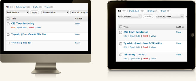
Prioritize your content, and if you’ve been hiding things behind hover states, make room to display them. The WordPress admin posts screen is a great example of this. Normally, action items are only visible on hover, but if you login with a touch device the links are always displayed.
Utilize tap to reveal a hover state.
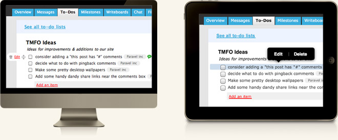
Depending upon the implementation, this can be risky; Amazon has done fairly well with this method for their category-based shopping navigation. The paneled list and orange arrows help to make those areas clearly tappable. Another example can be found in Basecamp’s edit and delete controls for to-do lists, milestones, and files. When you hover over one of these the action items appear. For touch-screens they’ve built a javascript popup that works fairly well once you’ve figured it out. The problem is that users get no cue that tapping the to-do text is even an option, and I can’t help but think a solution similar to WordPress would have worked better. That being said, I’d happily pay a few extra pennies per month to get a mobile version of Basecamp.
Build specifically for touch-screen devices
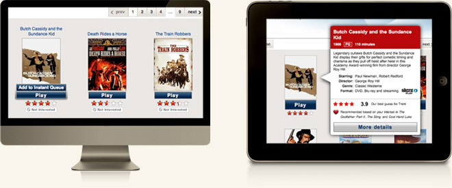
and take advantage of native device controls, gestures and popovers. Touch-screen apps for Twitter and Gowalla play a key role in their overall success and are probably used more than the websites themselves. I use the Netflix iPad app regularly, but in many cases it feels like a hover-dependent website dropped into an iPad viewport. Currently, if you’re browsing instant titles and want to add something to your queue by tapping, you’re looking at a 3 step series of taps instead of an instant hover reveal option with a point-and-click interface. If you’re going to build specifically for touch, you’ve got to follow through.
Wait for touch hover technology.
I’m not convinced this would do anyone any good. It may be exciting to see what Cypress has come up with, and to know that Apple has applied for a patent for a proximity sensing touch-screen, but this does worry me. I’d hate to see us revert to our old shortcuts and make user experience sacrifices just because the technology is in place. Plus, we’re going to look like a bunch of idiots who are afraid to touch our smart phones & iPads. On the bright side, Phil Dunphy would love it!
We’re going to be OK.
Ultimately, I think seeing hover states fade away will make the web a better place. There never has been any substitute for concise content, clear interaction, and simple design. If we focus on core elements that make browsing the web great, our sites will function properly no matter how people use them.