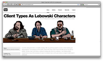
Update: Surprise—This post is now outdated & is about a previous version of this site. To learn more about what I’ve got cooking now, click here.
It may not look like it, but this version is a complete code & design overhaul. Tiny annoyances with my style sheet and page structure compounded over the past few months until I happily yielded to the urge to start messin’.
Outside The Box
I love the 960×400 pixel graphic playground that the banner box above provides. In this version I went a step further and built in the ability to define the style for the entire page body whether or not it fits in the banner box. Dave helped me adapt this code that pulls a custom css field from a wordpress post and echo it in the within the head tag.
Centered Page Layout
The left justified layout (shown right) provided an easy way to frame large & somewhat incomplete banner box photos, but having all that content shoved to one side felt unbalanced and drove me mad… sort of like sitting down with an overstuffed wallet in your back pocket.
Notes Section
This section is for quick posts, links and tips. I felt like it was bad e-karma to come across something valuable online & not share it. Most of us design types have googled “negative margins in ie6” or spent hours searching for some graphic inspiration. For those of you publishing good online content, I appreciate it.
Threaded Comments
WordPress offers it and I wanted to take advantage. Possibly (but probably not) unique to this site, my replies will be displayed in the right margin.
Shorter Line Length
While there is some debate on the optimal number of characters per line in regards to readability, I wanted to cut the 100+ CPL down quite a bit to suit my own preference. Narrowing the post entry column also defined a standard space to the right for blockquotes, photos, and reference links.
