CSS Columns
I frequently use CSS multi-column layout (i.e. column-count: 3) for basic list items limited to words or phrases (like my search page tags list), but I’ve always struggled to make the property work with more complex content. And after all, complex pages are where CSS columns would come in most handy—reflowing content in and out of columns across viewport widths to suit:
The first hurdle has always been avoiding module content breaking across columns awkwardly:
In the Codepen below, I added break-inside: avoid; to remedy this, but support is partial. In some browsers, additional whitespace may appear at the top of columns, and in others, content is dispersed unevenly across columns.
See the Pen CSS Columns For Layout V1 by Trent Walton (@TrentWalton) on CodePen.
As a next step, I added display: inline-block and removed all the break-inside: avoid; funny business. This switch was way desirable, but days later I noticed loads of extra whitespace below the columns (in Chrome at least). The amount depended on the arrangement of the modules and size of the content within, but it was a significant problem.
See the Pen CSS Columns For Layout V2 by Trent Walton (@TrentWalton) on CodePen.
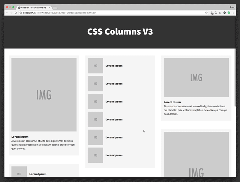
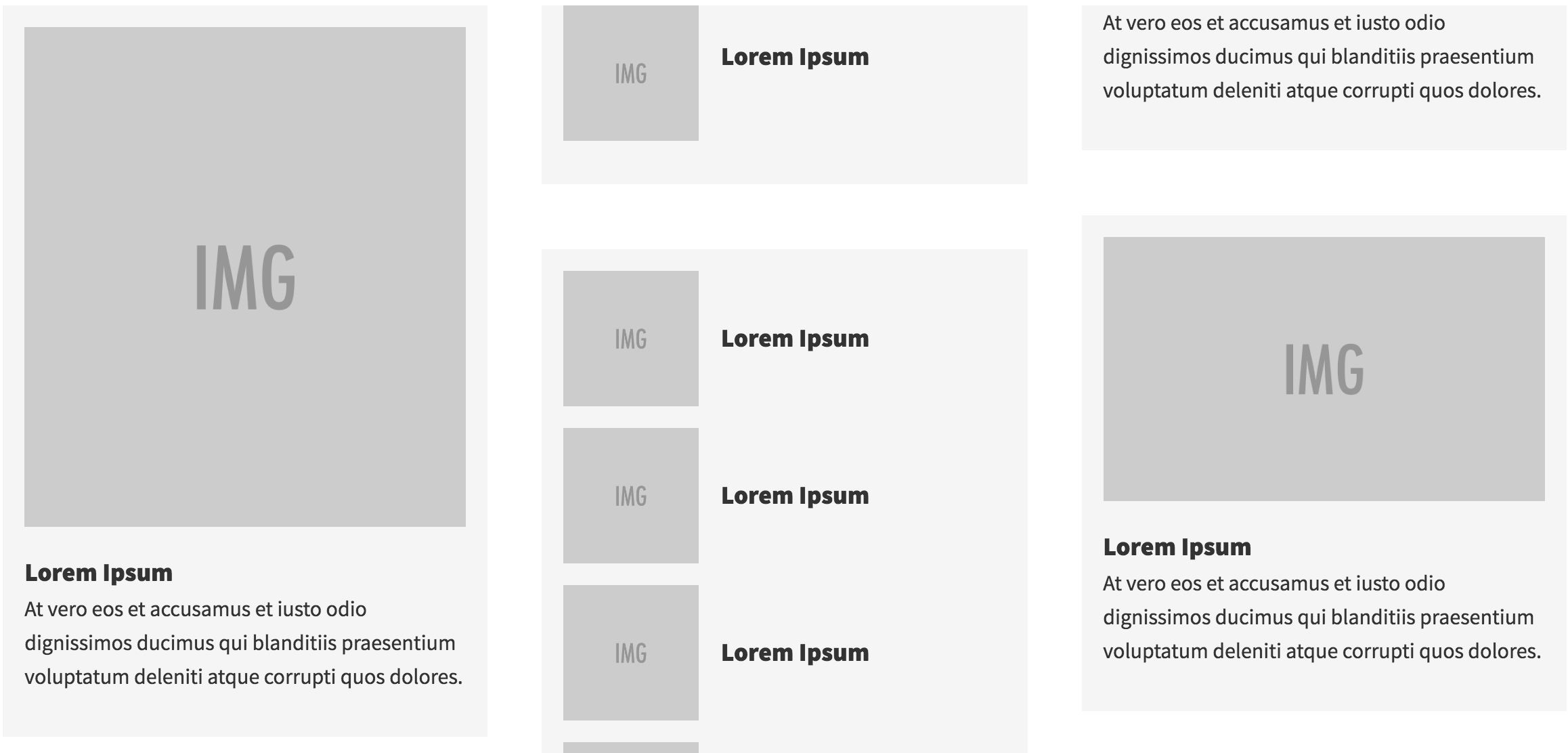
To remedy the whitespace problem, I came up with my current-final-answer (below). I added a <div> to each module, setting the outer one to display: block and leaving the inner one display: inline-block. The extra whitespace is gone, and the technique seems to be resilient to various types & sizes of content.
See the Pen CSS Columns For Layout V3 by Trent Walton (@TrentWalton) on CodePen.
I’m sure this technique will evolve & improve over time, but for now, I find it quite useful. Ta-da!