Viewport Padding
I was inspecting Ethan’s site the other day (as totally normal and well-adjusted people do) and realized he was using one of my favorite tricks where viewport units were combined with em units via calc() for vertical spacing.
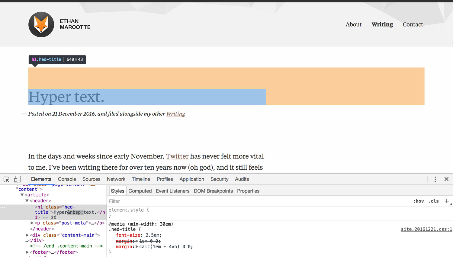
Viewport units can help you scale margin and padding across viewport sizes, but they can also grow or shrink beyond what’s intended. To compensate for potential awkwardness, Ethan combined vh with em via calc().
I created a Codepen to show a similar case with vw units.
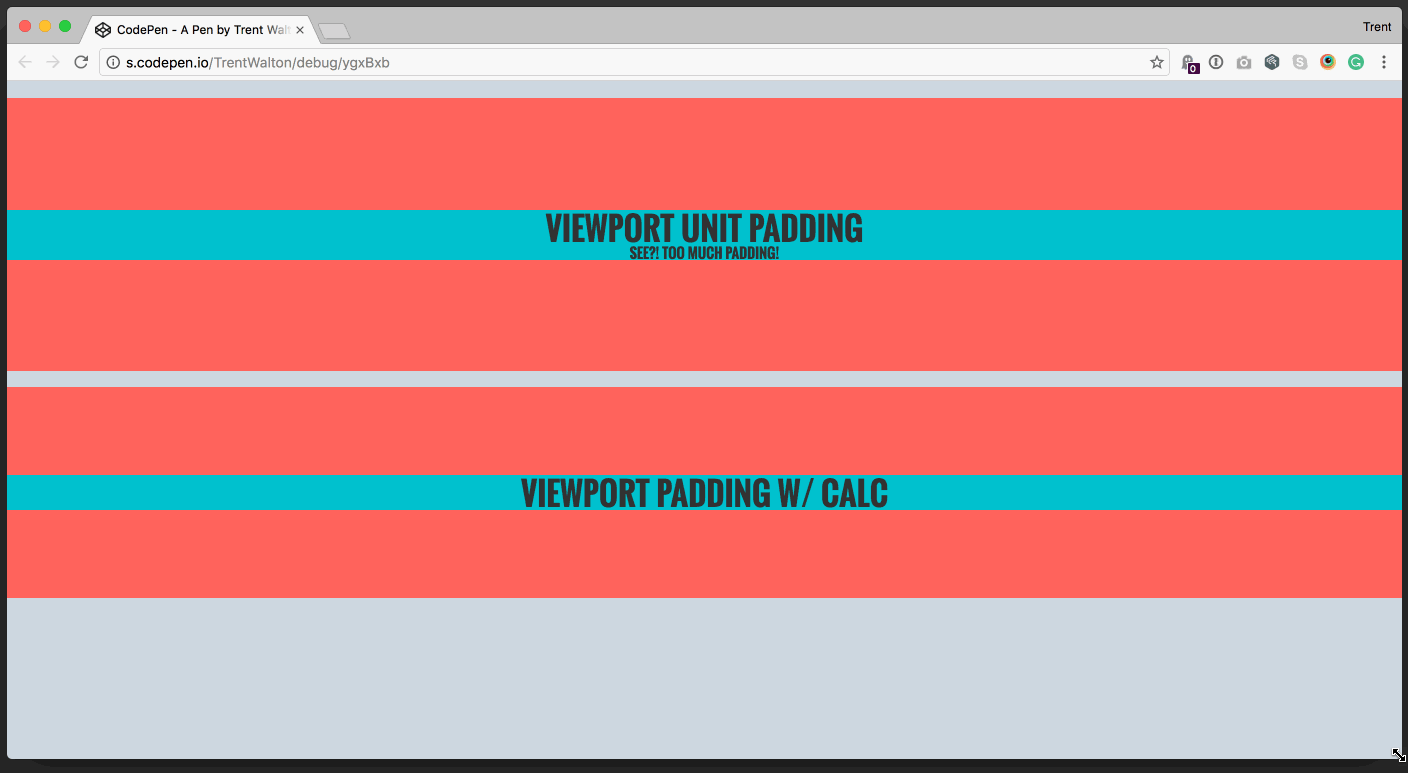
Note that .viewport-only has 8vw for padding, and tends to grow and shrink too much. .viewport-calc has calc(4vw + 2em) for padding, which scales without overdoing it at extreme widths.
.viewport-only{
  padding: 8vw 0;
}
vs
.viewport-calc{
  padding: calc(4vw + 2em) 0;
}
In my mind, it’s like saying, “here’s 2em of padding as a baseline with a few 4vw units sprinkled over for scalability.” I use this all the time. Happy padding!
Update: 02/07/17
Thanks, Jeremy, for pointing out a potential android pitfall.