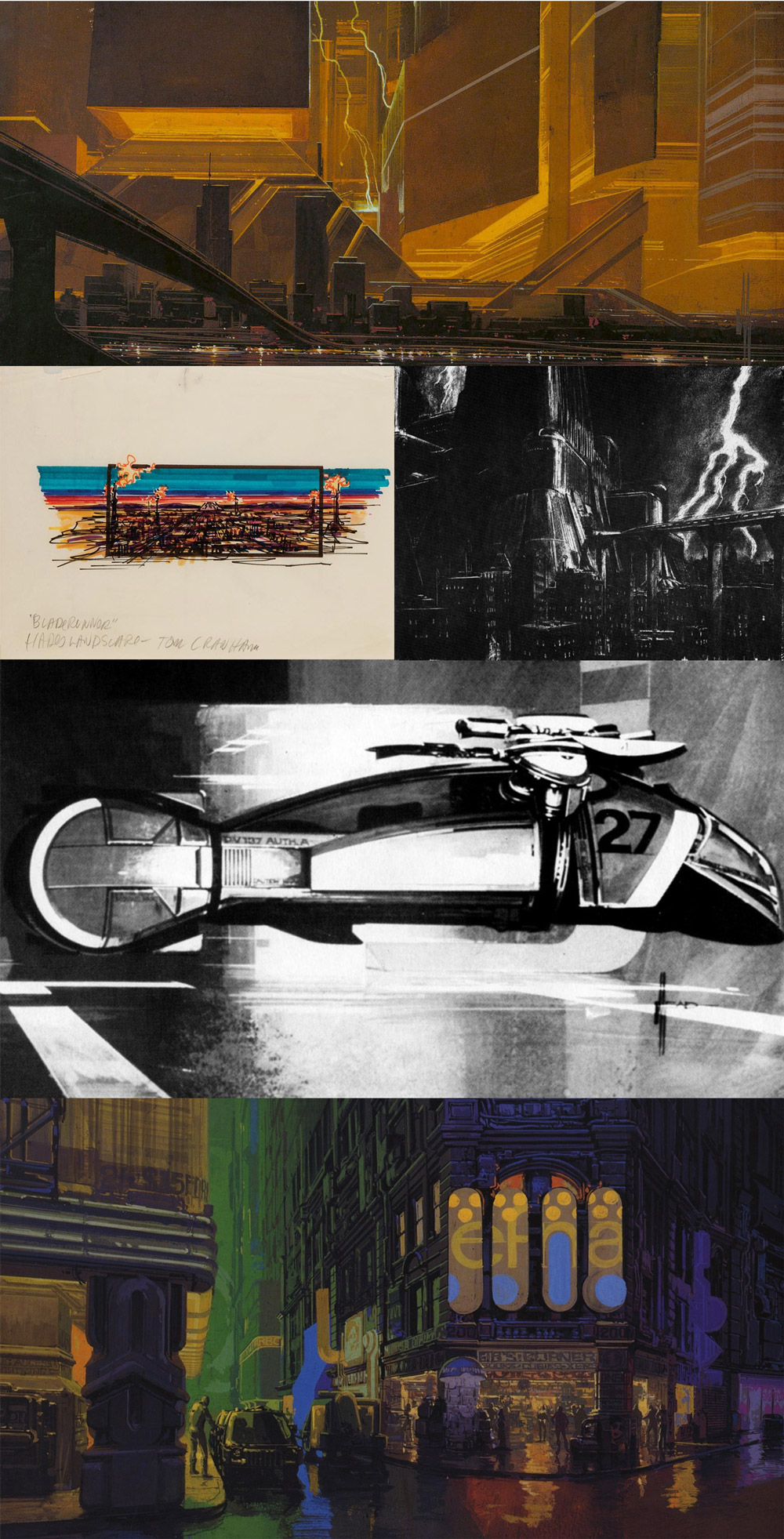
When asked what made him want to take on a Blade Runner reboot, director Denis Villeneuve replies, “I didn’t want somebody else to fuck it up.”“2036: Nexus Dawn” Short“2048: Nowhere to Run” Short“Black Out 2022” Anime Short
I’ve been listening to the NPR podcast How I Built This recently. The episode with Nolan Bushnell, the founder of Atari and Chuck E. Cheese, is my favorite so far. The entire episode is fascinating, but what Nolan has to say about entitlement (at the 42:20 mark) stood out to me.
There is nothing worse than feeling like you are invincible and really cool and entitled. Being entitled is probably the ugliest thing that a person can be—because all of a sudden it’s not what you do, it’s who you are. People who rely on who they are, as opposed to what they do, become very banal.
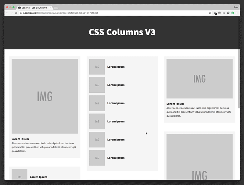
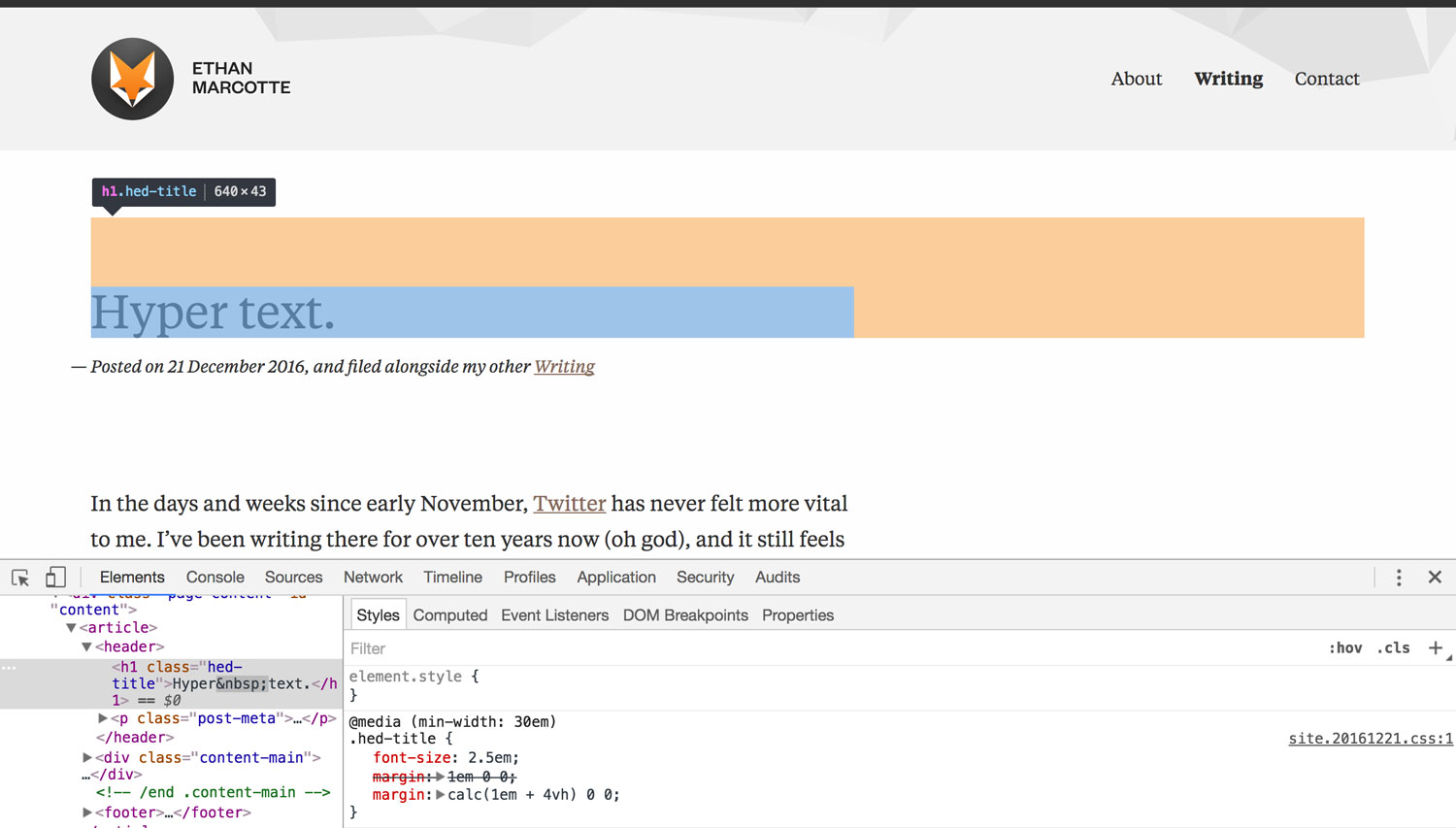
I frequently use CSS multi-column layout (i.e. column-count: 3) for basic list items limited to words or phrases (like my search page tags list), but I’ve always struggled to make the property work with more complex content. And after all, complex pages are where CSS columns would come in most handy—reflowing content in and out of columns across viewport widths to suit:
The first hurdle has always been avoiding module content breaking across columns awkwardly:
In the Codepen below, I added break-inside: avoid; to remedy this, but support is partial. In some browsers, additional whitespace may appear at the top of columns, and in others, content is dispersed unevenly across columns.
As a next step, I added display: inline-block and removed all the break-inside: avoid; funny business. This switch was way desirable, but days later I noticed loads of extra whitespace below the columns (in Chrome at least). The amount depended on the arrangement of the modules and size of the content within, but it was a significant problem.
To remedy the whitespace problem, I came up with my current-final-answer (below). I added a <div> to each module, setting the outer one to display: block and leaving the inner one display: inline-block. The extra whitespace is gone, and the technique seems to be resilient to various types & sizes of content.
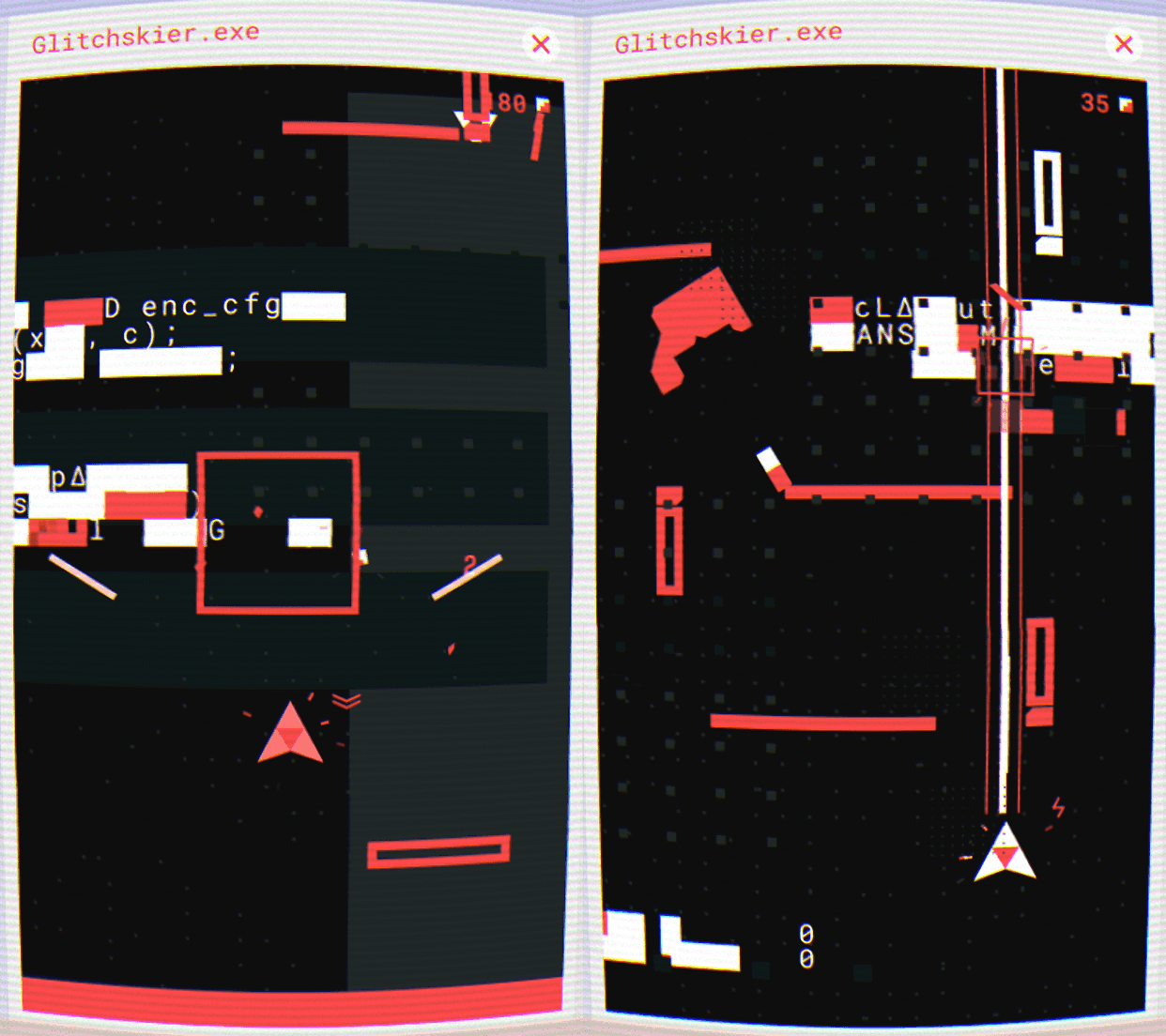
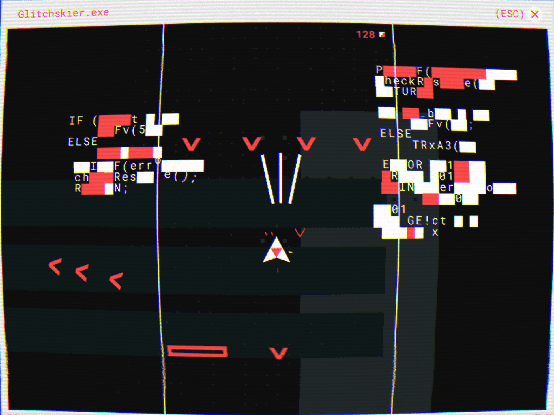
I recently discovered a new action game called Glitchskier by Shelly Alon. In case you aren’t aware, flying a triforce(ish) starship through what reminds me of the Stranger Things intro (music and all) blowing up Tron-like villains is right up my alley. I love every detail.
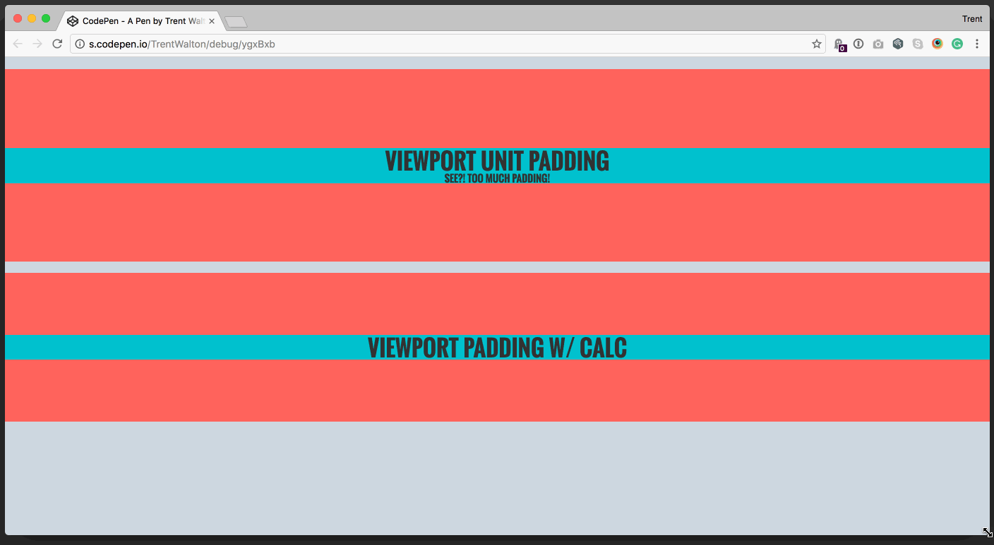
I was inspecting Ethan’s site the other day (as totally normal and well-adjusted people do) and realized he was using one of my favorite tricks where viewport units were combined with em units via calc() for vertical spacing.
Viewport units can help you scale margin and padding across viewport sizes, but they can also grow or shrink beyond what’s intended. To compensate for potential awkwardness, Ethan combined vh with em via calc().
I created a Codepen to show a similar case with vw units.
Note that .viewport-only has 8vw for padding, and tends to grow and shrink too much. .viewport-calc has calc(4vw + 2em) for padding, which scales without overdoing it at extreme widths.
In my mind, it’s like saying, “here’s 2em of padding as a baseline with a few 4vw units sprinkled over for scalability.” I use this all the time. Happy padding!
I love Alamo Drafthouse—It’s a big part of what makes Austin home for me, and part of my monthly (sometimes weekly) routine. The recently-updated announcement videos they run during pre-roll are fantastic. They’re extremely well done without coming across as too slick or corporate-y. I could be wrong, but I think I spy some Archive Type in there.
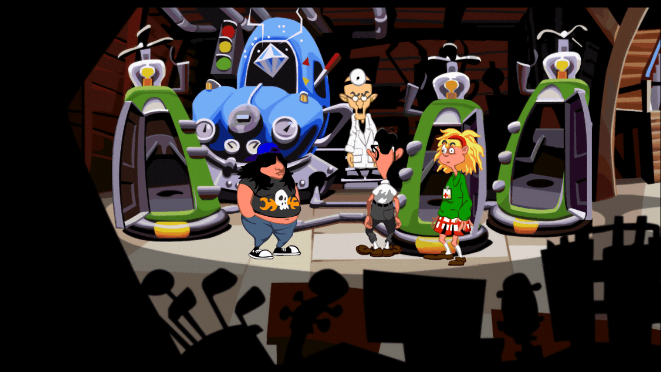
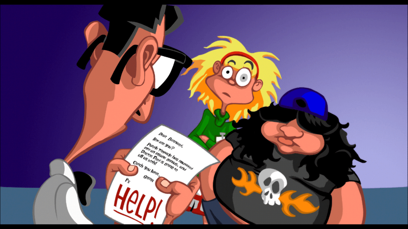
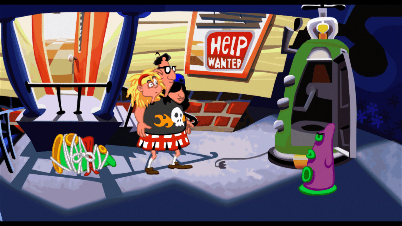
Over the weekend I rediscovered Day of the Tentacle, triggering the biggest nostalgia jolt I’ve experienced in quite some time. I vividly remember playing the game on one of my first PCs in 1993. The illustration style, no-lose style of gameplay, and voice acting is all spectacular. The newly remastered edition is a worthy update.
I’ve logged quite a lot of hours battling databases, plugins, and a GUI editor to write (and occasionally design) blog posts. Wordpress has served me well, but to simplify the process I’ve ported my blog to Jekyll. It’s great to be static! Writing already feels more casual and enjoyable.
Over the past few years, Paravel has used Jekyll to build the latest version of our site, Dave’s blog, Reagan’s blog, TMFO, and the DayTrip Blog. We even use it regularly for prototyping with clients.
The familiarity I’d gained on those projects made the process relatively easy. Here’s a rough outline of how it went:
Fixed broken paths thanks to find & replace in project
At this point, I decided to leave off comments for now. I’m still on the fence, but am going to experiment with correspondence via social channels and (hopefully) other people’s blogs :)
There are heaps more to optimize and improve, but it’s been an enjoyable experience thus far. The writing process feels great again, and I have a new place to play (even though it’s the same old blog)!
Let me know if you spot any glaring errors or omissions. In the meantime, I’ll just leave this list of ideas for future improvements here for reference:
Improve performance
Clean up (reduce) tags
Research CDNs & caching
Think about sans body type
Experiment with CSS Grid on my homepage
Tie in other articles with more TLC than tags
Build a new layout for non-legacy articles so I can create unique article designs easier
The thing is to be true to the idea. A lot of artists think that suffering is necessary, but in reality, any kind of suffering cramps the flow of creativity. […] Happiness in the doing is so important. And I always say it’s our life going by.