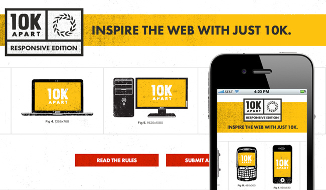
10K Apart: The Responsive Edition
This year at Microsoft’s SXSW IE9 release party, I finally got the chance to meet Nishant Kothary. I was happy to have the opportunity to convey how appreciative I was of his role in making Lost World’s Fairs happen in person. He really turned the Operation Condor team loose and fully supported our vision from start to finish. Little did I know, he had Paravel in mind for an upcoming gig: Designing the follow-up to last year’s 10K Apart site, beautifully done by Things That Are Brown. But this year’s edition had to be different—the site and all of the app submissions had to be responsive!
After confirming that we’d be thrilled to provide design and front-end code in person, and again in numerous “OMG is this really happening?” emails, The [This year at Microsoft’s SXSW IE9 release party, I finally got the chance to meet Nishant Kothary. I was happy to have the opportunity to convey how appreciative I was of his role in making Lost World’s Fairs happen in person. He really turned the Operation Condor team loose and fully supported our vision from start to finish. Little did I know, he had Paravel in mind for an upcoming gig: Designing the follow-up to last year’s 10K Apart site, beautifully done by Things That Are Brown. But this year’s edition had to be different—the site and all of the app submissions had to be responsive!
After confirming that we’d be thrilled to provide design and front-end code in person, and again in numerous “OMG is this really happening?” emails, The](http://visitmix.com/) / Sunder Media / Paravel team rallied on Basecamp with lots of exciting work ahead of us. We’d already cut our responsivizing teeth on The Do Lectures site as well as this blog, so we were eager to put our ever-evolving responsive design process to work, building a site that looks great at any width.
We started by having Reagan guide us through selecting a direction for the design. True to Paravel form, a bunch of automotive user manual scans wound up in our mood boards, so we settled on a throwback “Responsive Toolbox” vibe. From there Reagan designed some fantastic full-width desktop views with that level of sensibility & restraint we lean on heavily for all our Paravel projects. You can read and see more on Reagan’s design process here.
Once our desktop views were approved we teamed up to build the alternate media-queried layouts in the browser, though this wasn’t by any means all improv. We designed elements at full-with with an understanding of how they would relocate as viewports narrowed without breaking the site hierarchy. My recent post, Content Choreography, summarizes a lot of the opinions & tricks we put into practice on this site.
Dave and I had a blast coding this site. The design is covered in subtle textures, and it’s got features like image rotators, functional hover states and forms. We were eager to prove to ourselves that each of these items could be made responsive easily, and I’m happy to report that they were. It further reinforced that responsive web design doesn’t have to break your brain, or the bank for that matter.
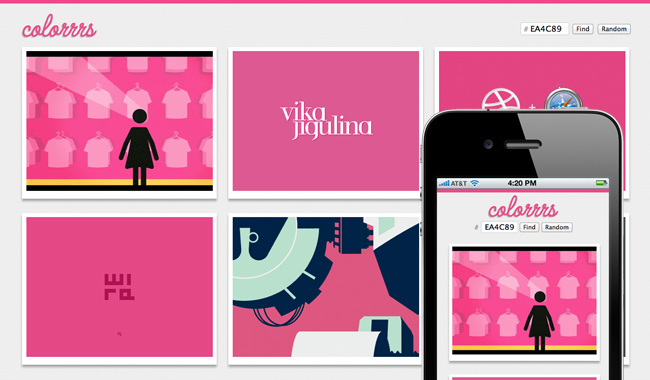
The day our front-end portion of the site was completed, Dave “cannot be stopped” Rupert decided to build a responsive app himself. Check out Colorrrs! Read about Dave’s role & the Colorrrs app here.
Gosh, I hope this isn’t the last project post I’ll write for a collaboration with the Mix Online team. The honest truth is that we couldn’t be happier with the work we get to do here at Paravel. A Texas-sized thank you to Nishant & Joshua for brining us on board and to Ian for his fantastic dev work.
Check out our work on this year’s 10K Apart: The Responsive Edition. Also, Check out project posts from the Mix Online team, Nishant, Reagan, and Dave.