The concept of permanently placing content on a web page for a single browsing width or resolution is becoming a thing of the past.
Media-queried responsive & adaptive sites afford us the ability to re-architect content on a page to fit its container, but with this exciting new potential come equally exciting challenges. Web designers will have to look beyond the layout in front of them to envision how its elements will reflow & lockup at various widths while maintaining form & hierarchy. Media queries can be used to do more than patch broken layouts: with proper planning, we can begin to choreograph content proportional to screen size, serving the best possible experience at any width.
As I step into my 3rd responsive project with Paravel, I’ve made a habit out of picking apart media-queried sites I happen across, noting how things get rearranged at various widths. At times, it seems as though all of the site architecture & planning goes out the window as content reflows. I’ve also found that what might work very well for one type of content or site might not work so well for another.
Content Stacking
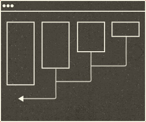
This is unavoidable. Take a 4 column site at full width: as the view narrows, 4 will become 3, then 2, and 1. The most common solution is to stack them on top of each other in chunks (fig. a). Simple enough, but what happens if the first column is really tall? Is the content in column 2 less important than all of the content in 1? It probably is for something like a full-length article, but I can’t help but think that in some cases, this method throws off the hierarchy.


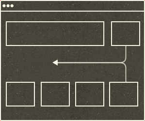
Another approach could be to interdigitate content by folding elements into each other as the view narrows (fig. b). In real terms, what happens if a main column is a tall grid full of product thumbnails, and the sidebar features a coupon or promotion? When those columns are combined, it might be nice to slide the promo in between two product rows instead of shuffling that important piece to the bottom of the main column.
The Content Change-up
Another thing I’ve noticed is that media queries are being used to significantly redesign pages. I’ve seen background colors change and top-level elements move from left to right. If critical thought is applied here those choices may be spot on. But what happens if a user visits at full-width one afternoon and revisits your site in the evening on a tablet, and everything looks completely different? It’s annoying—like someone rearranging the groceries in your pantry every time you closed the door. The power of media queries can be intoxicating, but just because you can doesn’t mean you should.
De-compartmentalize the Workflow
The production model of passing a site down the assembly line from design to development to launch seems to be an inefficient approach for responsive & adaptive site design. I think the Paravel method of gathering around a table & slugging every decision out until launch lends itself to the level of reiteration necessary for these projects. We’ve found that the best way forward is to pull all members of a team together to design, build, test and then evaluate in multiple quick rounds.

Of course, the alternative would be to create designs for every media query you plan to include, but that kind of thinking seems inefficient and fails to take advantage of the device-agnostic approach that responsive web design offers. In my mind, it’s best to build something that works on any possible width or device instead of something that works on all current widths and devices.
Balancing all of these new facets of the web designer’s role may seem overwhelming, but that’s the nature of the profession and one of the reasons why I love it. Honing the craft of content choreography will help us to orchestrate the best experience possible at any screen size or resolution. In time, I believe knowing what works best will become second-nature to us—just like designing progressively enhanced CSSed pages without tables or superfluous markup is now. The best thing for us to do? Practice!
Update: 7/26/12
Jordan Moore has a fantastic article and demo on using flexbox to choreograph content. You should check it out.</ins>