IE9 public beta is here, and I’ve had the fair fortune to be recruited by The Friends of Mighty to showcase its support for the Web Open Font Format (WOFF).
A while back, Jason Santa Maria called to see if I’d be interested in joining him on a team with Frank Chimero & Naz Hamid. After confirming my participation, as well as the fact that this wasn’t a practical joke, I learned that our mission was to create 3 web poster sites that showcase WOFF and how well IE9 supports it. After a couple of team Skype meetings we decided to follow a Lost World’s Fairs theme, which was an appropriate match for the adventurous nature of the project as well as the team. My primary role being CSS & HTML code-out, I knew I had to start by doing two things: bring Dave Rupert in for additional dev support, and learn all I could about IE9.
IE9 Preview
Building for an unreleased browser with a subject-to-change property support list was equal parts daunting and exciting. I knew the stakes were high. I’ve built plenty of websites where the layout depended on one or two properties to really sing, so I had to be 100% sure I was giving the team accurate information. I began experimenting by coding a series of sandbox pages where I’d test IE9’s support for CSS properties listed in the developer guide. I was glad to see support for many of the properties I hoped we could lean on heavily during the design & code-out:
- @font-face / WOFF
- Multiple Backgrounds
- Border-Radius
- Box-Shadow
- RGBA & HSLA Color
- Selectors / Pseudo-Classes
Not only were many of the CSS3 staples supported, but when compared to Webkit & Mozilla engines, IE9 actually out-performed in a few cases. For example, a border-radius & box-shadow combo actually looks better in IE9. Eventually, I’d like to one day see text-shadow, CSS transforms and maybe even animations supported to the same high standard as the modules for backgrounds, borders, color and fonts.
Lettering.JS
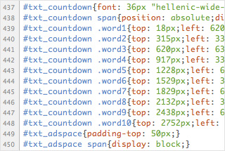
Early on we realized that because these poster-style layouts were going to be tuned to the letter, we’d need to find a way to match that attention to detail while keeping the markup manageable & agile. This problem of avoiding heavy markup facilitated Dave’s creation of Lettering.js. Dave has provided an introductory write-up & GitHub download here. On projects like this, where large-format type is front and center, this jQuery plugin saved the day.
Tandem Dev via Dropbox
Dave and I were able to code-out different aspects of the site by setting up our own localhosts & working from the same folder we share via Dropbox. He’d position elements on the page in a structural CSS file while I’d finesse the lettering in a type CSS file until each page was pixel perfect. It took steady communication, but once we ironed out the kinks we were able to have the initial code finished for each of the 3 poster sites in 3 days.
El Dorado
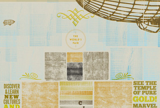
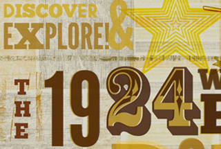
The Hatch Show Print take on a 1924 fair in El Dorado by Naz was fueled by his interest in experimenting with rgba/hsla color and opacity. Because tweaking hue, saturation & lightness is so intuitive with hsla, we were able to adjust the tones for each individual letter, blending them into the textures and colors underneath. We used CSS-pseudo elements to double up on lettering, giving the poster an authentic, rough-around-the-edges look. During an impromptu screen-sharing design session, Naz and I used Jon Raasch’s Scrolling Parallax jQuery plugin to finish the page by floating Zeppelins across the skyline.
Atlantis
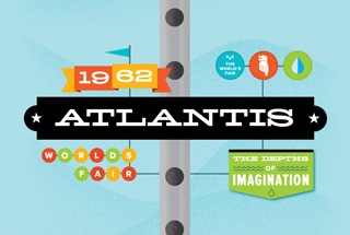
Frank’s 18,123 pixel (or 20,000 league) journey into Atlantis is the reason multi-touch / smooth scrolling was invented. Above water, the horizontal, percentage-based background tracking shifts the ocean-scape as you resize your browser window. Below water, you’ve got a fixed-positioned sea elevator and a depth tracker (built with javascript by Dave) that accompanies you as you scroll through various layers of aquatic life. The 10 year old me loved building this page. If there were a Journey to Atlantis lunchbox, I would buy it and carry my iPhone around in it.
The Moon
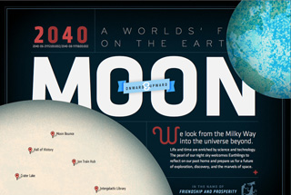
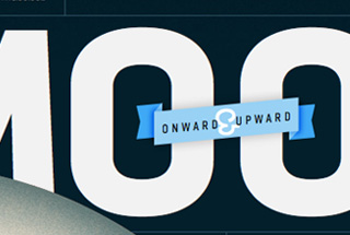
Jason created a look ahead to 2040 with a Worlds’ Fair that considers the possibility of humans settling on the Earth’s Moon. The celestial interplay of the Earth and Moon on the page was achieved through percentage-based fixed positioning. The same was done for the poor unfortunate spaceman (if your browser window is wide enough to find him). The Worlds’ Fair logo was done with 100% CSS, using border radius to create both the containing circle and the top-right orbital sphere.
The Landing Page
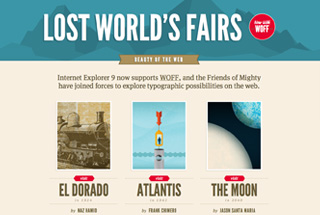
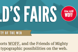
My design contribution to the Lost World’s Fairs was the landing page. I thought a colorful, travel poster inspired approach would serve as a great introduction for each fair. My type lineup consists of League Gothic for all the heading fonts, FF Market Web for the script and my favorite serif, FF Meta Serif Web Pro for the body text. It was extremely humbling to be trusted to take on this leg of the project, and I had a great time doing it.
Operation Condor: Complete
Praise be to Nishant Kothary and the MIX Online team at Microsoft for giving us complete freedom to create and for getting behind the vision. Congratulations on the new browser and the huge leap forward.
The only downside to our project (dubbed internally as Operation Condor) is that we’re finished. Being able to team up with such talented people as Jason, Frank, Naz and Dave, has been an honor and a privilege to say the least. I felt like Louis Tully, suiting up as a Ghostbuster and running around the streets of New York for the first time. “Stay fit. Keep sharp. Make good decisions.” It’s good to be a Friend Of Mighty.
